
A system, not a series
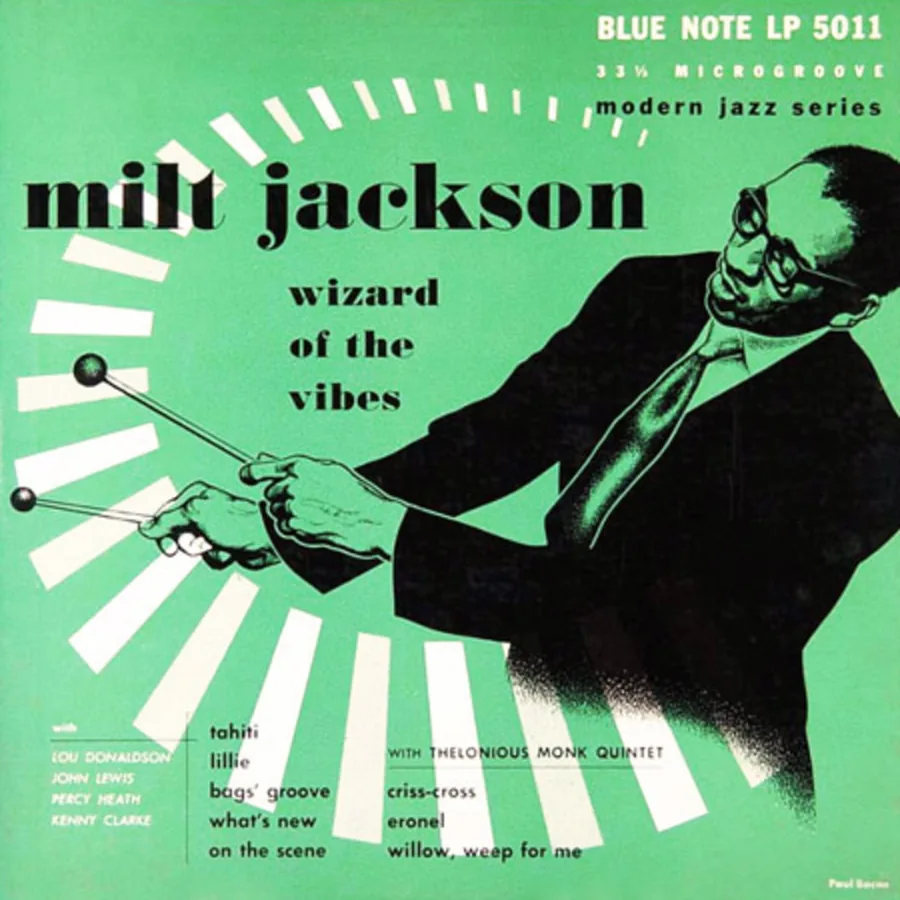
Over the decades, most labels have put out a few remarkable covers. Blue Note put out a language. Between the late 1950s and the mid-1960s, under Reid Miles's art direction, Blue Note album covers from the New York label formed a visual system of rare consistency, and its influence is still spreading sixty years later. Each cover stands on its own and means more as part of the whole. Understanding what it takes to build a coherent visual identity around a record often comes down to studying what Blue Note pulled off in ten years.
Blue Note Records was founded in New York in 1939 by Alfred Lion, a German immigrant who had fled Nazism, joined in 1941 by his friend Francis Wolff. Lion produced, Wolff photographed the sessions. From the start the standard ran two ways. The music (bebop, hard bop, soul jazz, avant-garde) was recorded only if it was played the way it should be, and everything around it, cover, liner notes, presentation, got the same seriousness. It was a founders' conviction, not a strategy, and that's why it lasted.
Francis Wolff, the eye in the room
Before the typography and the layout, there are the photographs. Francis Wolff spent his nights at Rudy Van Gelder's studio, in Hackensack and later in Englewood Cliffs, catching musicians in the effort of playing. No posing, no commercial portraits. Flash pictures taken through the smoke, during takes, between two bars, at the moment a musician closes his eyes.
These photographs have a physical presence studio photography never reaches: the blur of a gesture, sweat on a forehead, a body bent over an instrument. Nor is it photojournalism. The images are composed and attentive to light, without ever pulling away from what's happening in front of the lens.
That archive of photographs was Reid Miles's raw material. The tension between the two men produced some of the strongest images in the catalog. Wolff wanted the whole photo; Miles cropped it, cut it, sometimes darkened it almost entirely.
Reid Miles, the designer who didn't like jazz
It's the most quoted fact about Reid Miles and it still surprises: the man who designed between 350 and 500 covers for America's biggest jazz label didn't like jazz. He preferred classical music, received a copy of every album and gave them away or sold them. Alfred Lion would describe a session to him in a few words, the tension, the mood, the movement, and Miles turned that into design without ever dropping the needle on the record.
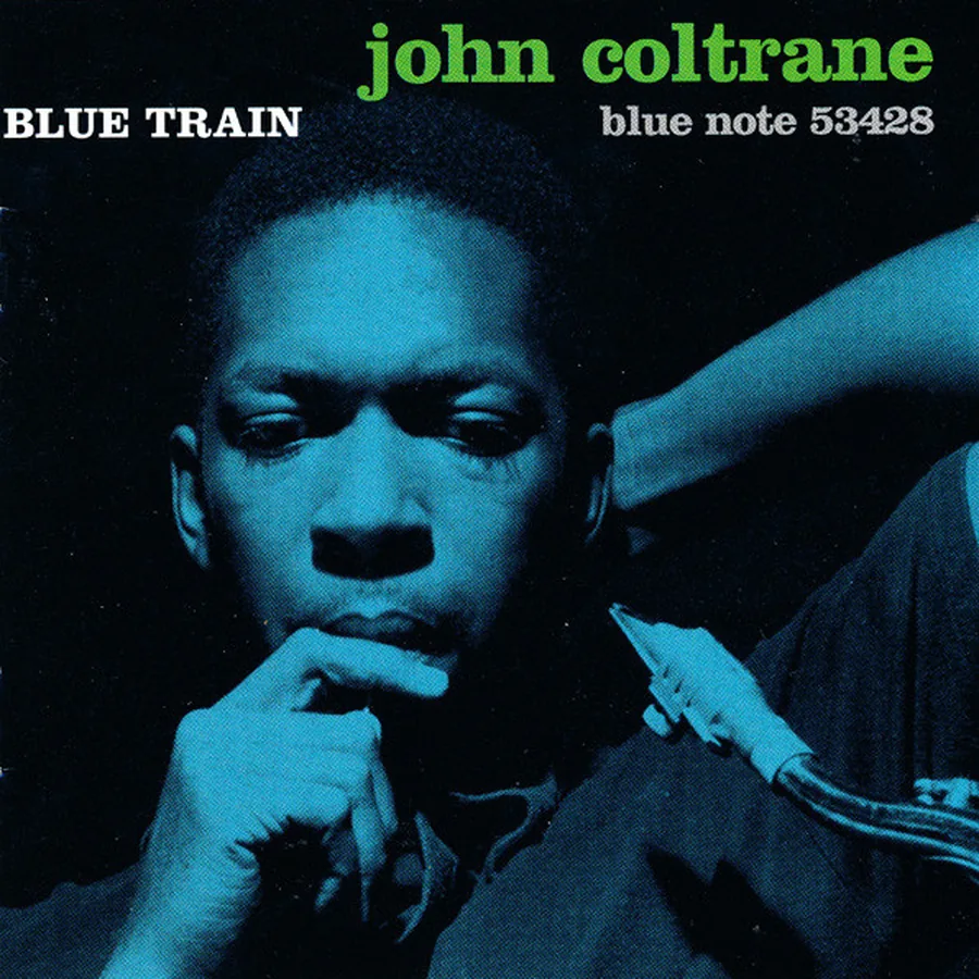
That distance partly explains why his covers work so well. Miles treated the music as a design problem, with no nostalgia, no deference, no urge to illustrate what he heard. He took Wolff's photographs as raw material, cropping them, tinting them, sinking them into blocks of color, sometimes reducing a face to a few points visible in the dark. Wolff found it irritating. The result beat the original photo every time.
Miles joined Blue Note in 1956 and stayed eleven years. That constancy, a decade with a single label in a single format, is what makes the body of work so impressive. A visual language doesn't come together piecemeal, and Blue Note gave him the repetition and the constraints a style needs. Josey Records has an annotated selection of his best covers that shows how wide his range was.

Color as a signal, not decoration
Color is the most instantly recognizable trait of Blue Note covers. Two or three saturated colors, often in outright opposition: acid yellow and black, blue-green and off-white, orange and gray, magenta and black. The reduced palette isn't a budget constraint. It's a choice that produces instant clarity.
Miles knew a cover is first seen from a distance, on a shelf or in a record bin, among dozens of others. Color has to work from far away before it works up close. The principle is common in posters, signage and print media, but rarely applied to records with this much rigor. At Blue Note, every cover has a dominant color that identifies it from ten meters away; the rest of the design confirms what the color announced.
Typography as architecture
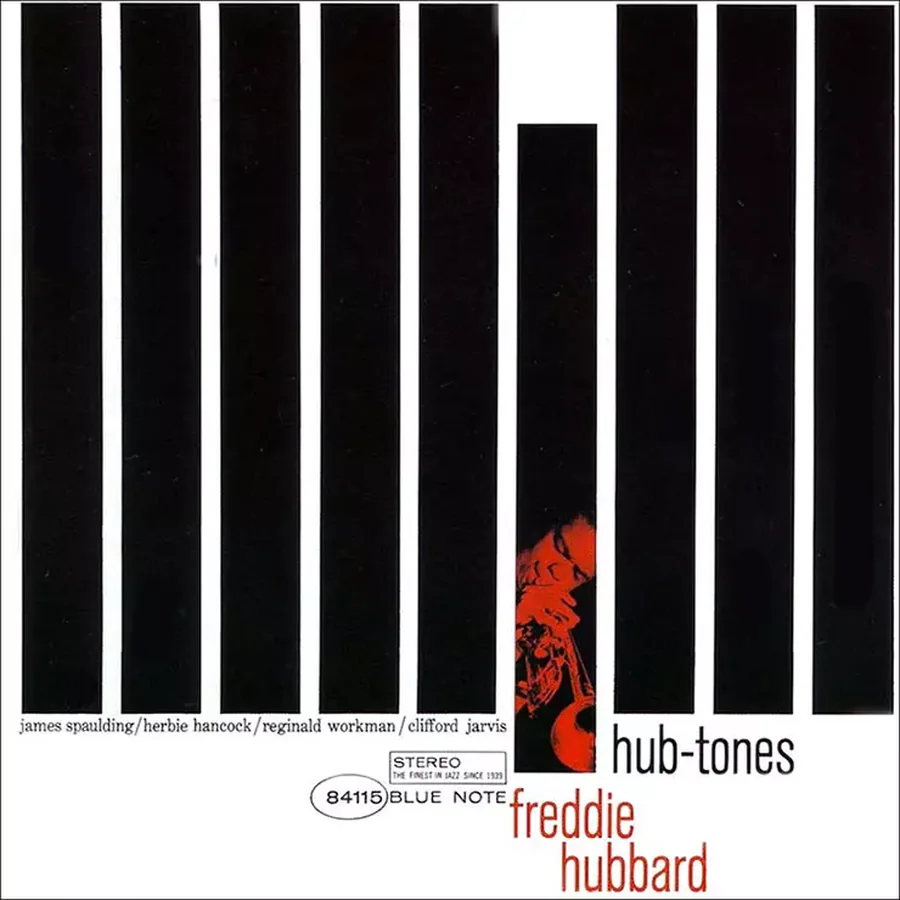
Freddie Hubbard's Hub-Tones (1962) is one of the most radical covers in the catalog. The front is almost entirely taken up by black and white columns, alternating with a regularity that recalls the Bauhaus or Mondrian. In one of the slits a small orange figure, Hubbard with his trumpet, appears, crushed by the geometry. The musician's name and the title sit at the bottom, small, almost discreet.
The cover sums up Miles's method. Type and graphics contain the photo, structure it, sometimes overpower it. Coming from posters and print media, he treated the vinyl square as a surface to compose rather than a frame to fill. His letters don't sit on top of the images; they merge with them, push against them, cut them up. Blue Note was practicing that fluidity between text and image, later central to contemporary graphic design, in 1960.
Una Mas, the cover as synthesis
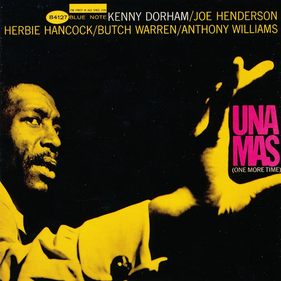
Kenny Dorham's Una Mas (1963) gathers nearly the whole Blue Note language into one square. The background is golden yellow, warm and saturated. The backlit silhouette of the musician fills the left two-thirds, his cast shadow drawing a second shape on the ground. The title "UNA MAS" is split into two blocks of different colors, white and magenta, that don't line up on the same baseline. The musicians' names, top left, small, in a sans serif, serve as a factual reminder in a space dominated by abstraction.
The image teaches hierarchy. Everything is there, name, title, photo, color, but organized around tension instead of flat harmony. Miles was after calculated optical discomfort, the slight asymmetry that makes the eye move and read the image over time. A cover that gives itself away too fast closes just as fast.
Us3, 1993, hip-hop borrows the coat
In 1993 the London group Us3 released Hand on the Torch on Blue Note itself, an album built almost entirely from samples of the label's catalogue. The single "Cantaloop (Flip Fantasia)" is a reworking of Herbie Hancock's "Cantaloupe Island". The label opened its archive to hip-hop, and hip-hop took the whole package: the sound, the name, the aura of the sleeves.
The borrowing shows how far the Blue Note language really reaches. It isn't tied only to jazz, to one era or to one city. It stands for seriousness, density, and Black American culture as a source of visual sophistication. A rap record under the Blue Note name, thirty years after Reid Miles, is the clearest sign that this graphic system has become common property.
That longevity comes from the fact that Blue Note design isn't a dated style but a set of principles: economy of means, tension between photo and type, color as a signal, asymmetric composition. They work independently of their era, which is why design schools still teach them and every genre still picks them up.
What this body of work teaches about visual identity
The Blue Note legacy is documented by TypeRoom, which traces its typographic influence. The analysis confirms that a label's consistency, its ability to be recognized before it's read, can't be decreed. It's built through repetition, constraint and dialogue between practitioners who share the same convictions.
Lion wasn't trying to create a visual identity in the marketing sense. He wanted the music he recorded to be surrounded by objects worthy of it. Miles wasn't trying to make jazz appealing to a reluctant public. He solved design problems with the tools he had. That absence of commercial calculation produced something irreplaceable.
Blue Note shows that a cover becomes memorable not because it's beautiful, since beauty is forgotten, but because it's right: in its proportions, in its contrasts, in what it says about the sound it wraps without trying to depict it.
Takuya Studio designs record covers for independent artists and labels, on the idea that a catalog's visual consistency starts with the first cover.