
Two genres, two ways of living in the square
Two musical genres, two visual histories that barely overlap, two almost opposite ways of imagining a record's image. When you think of the record sleeve as a space for expression, genre is never a neutral backdrop. It carries conventions laid down over decades, a collective memory of images the audience has absorbed before reading the title. A designer who ignores that memory isn't working freely. They're working blind. The point of techno vs jazz album cover design isn't to copy an existing style. It's to understand the relationship each genre has built with images, so you can take hold of it, or move away from it, knowing why.
The vanishing artist and techno's anonymity
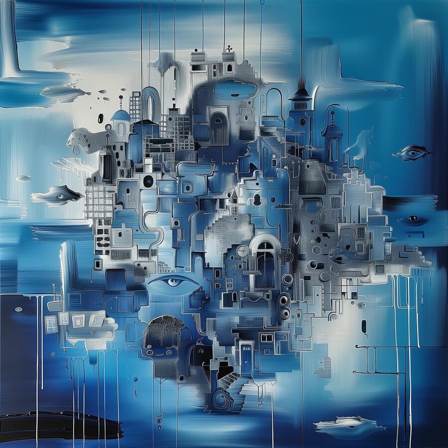
Techno has a complicated relationship with being seen. Born in Detroit in the late 1980s, out of a specific social context, it grew an early distrust of the artist as a figure and, by extension, of the portrait. Underground Resistance, Mike Banks's label, with Robert Hood among its early members, pushed that logic all the way to militant abstraction: covers that identify no one, masked artists on stage, imagery borrowed from industry and science fiction. Warp Records, in Sheffield, built another version of the same refusal by handing its covers to artists and designers whose work came before the musicians' identities. The Designers Republic, a studio from the same city, shaped the look of dozens of Warp albums with laboratory consistency. Cold geometry, reduced palettes, display type.
In techno, the image doesn't illustrate the artist. It carries the music into another sensory territory, often geometric, industrial, deliberately impersonal. The cover isn't an invitation. It's a surface.
The portrait as argument in jazz covers
Jazz has the opposite tradition, and one just as deliberately built. Blue Note Records, founded in New York in 1939 by Alfred Lion, invented a visual language based on the strength of the portrait: the musician caught mid-performance or at rest, framed tight, carefully lit. Francis Wolff, the label's in-house photographer for thirty years, built a body of portraits that still defines what jazz "looks like" for most people. Alongside him, art director Reid Miles developed dense, high-contrast typography, playing with offsets and sudden jumps in point size. He treated text as a shape in its own right rather than a caption.
ECM Records, at the other end of the spectrum, chose to drop the portrait in favor of landscape. No visible artist, no studio, no neon. Horizons, surfaces, evening light. The human is there in negative, in the choice of music and in the sensibility behind the image selection. This isn't techno's anonymity. It's a withdrawal that still reads as an editorial gesture, personal and inhabited.
What typography says about genre
You don't pick the same typeface for a techno compilation and a contemporary jazz record. Obvious, maybe, but worth spelling out, because it exposes conventions that often go unspoken and that an unwary designer can break without knowing it.
Jazz tolerates, and sometimes calls for, script type, classic serifs, hand lettering. Reid Miles's covers play on contrasts between sizes, white space and angles. There's something human in that controlled irregularity: the type carries the trace of a hand, even when it was set in hot metal or on a phototypesetter. Techno leans toward grotesques (Helvetica Neue, Univers or their digital cousins) or toward industrial display faces borrowed from signage. Techno type isn't trying to charm anyone. It wants to be legible from ten meters away, on a flyer photocopied in a basement, under black light.
Black and white, common ground read differently
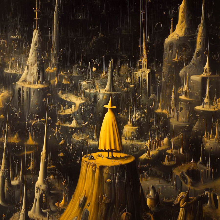
Both genres are drawn to black and white, and that's where confusion can creep in. Jazz black and white is often film photography, grainy, warm despite the absence of color; it holds the trace of light, of time, of the negative. Techno black and white is often vector, flat, printed. It erases rough edges instead of celebrating them. The same absence of color produces two very different visual objects.
What speaks is the treatment. The resolution, the grain or the lack of it, whether there's texture, the balance between deep blacks and the grays in between: each of these settings encodes a belonging the audience senses instinctively without being able to put it into words.
Building an art direction that doesn't lie
Designing a cover for a techno or jazz artist without thinking about these conventions means risking an image that says the wrong thing. A designer who applies the Blue Note look to an industrial techno project sends a contradictory signal. The reverse holds too. A minimal geometric cover on an intimate quartet record betrays something of the music, nobody can quite say what, and the audience feels it.
What the two aesthetics share is internal consistency. Neither is improvised. Both are built on precise knowledge of the genre, its visual history, and what a trained audience picks up in under a second. Art directing a cover isn't a style exercise. It's an act of interpretation, and a fair interpretation starts with listening.
Takuya Studio designs album covers for independent artists and labels in jazz, electronic and experimental music, on the principle that the image should live up to the music it goes with.