
The most beautiful sound next to silence
In 1969, in Munich, a producer in his mid-twenties founded a label with a motto that read more like a program than a slogan: the most beautiful sound next to silence. Manfred Eicher, a former double bassist trained at the Berlin Hochschule für Musik, wanted to record jazz and contemporary music with a standard of sound almost unknown at the time. That standard called for a visual one to match. At ECM, the album cover as a territory of its own has always been taken as seriously as the recording.
Five decades on, ECM Records album covers make up one of the most coherent bodies of visual work in the history of recorded music. They aren't the most spectacular. They are the most recognizable. You can spot an ECM sleeve thirty meters away in a record bin without reading a word, and the logo has nothing to do with it, since it sits tiny in a bottom corner. It comes down to a kind of presence.
Barbara Wojirsch, building a language before it had a name
Barbara Wojirsch trained at the Stuttgart Academy of Fine Arts. From 1970 she designed ECM sleeves with her husband, Burkhardt Wojirsch, and the work was signed "B & B Wojirsch". After his early death in the mid-1970s she carried on alone until she retired in the mid-1990s, with more than two hundred sleeves to her name, for Keith Jarrett, Dave Holland, Chick Corea and Steve Reich among others.
She set down rules that were never written anywhere. Photography over illustration, landscape over portrait, empty space over filled space. Type is there to inform, briefly, in a corner. Color appears only when the image asks for it. It is an aesthetic of abstention, and abstention is far harder to keep up than abundance. The People's Graphic Design Archive has a fuller account of her role.
Helvetica and the vertigo of empty space
ECM's typography has relied almost entirely on Helvetica, designed in 1957 by Max Miedinger and Eduard Hoffmann for the Haas foundry in Münchenstein, and later on its redrawn version, Helvetica Neue. A neutral face, chosen for its neutrality. The text is small and placed with care, usually top left. The artist's name, the title, and nothing more: no subtitle, no visible catalog number.
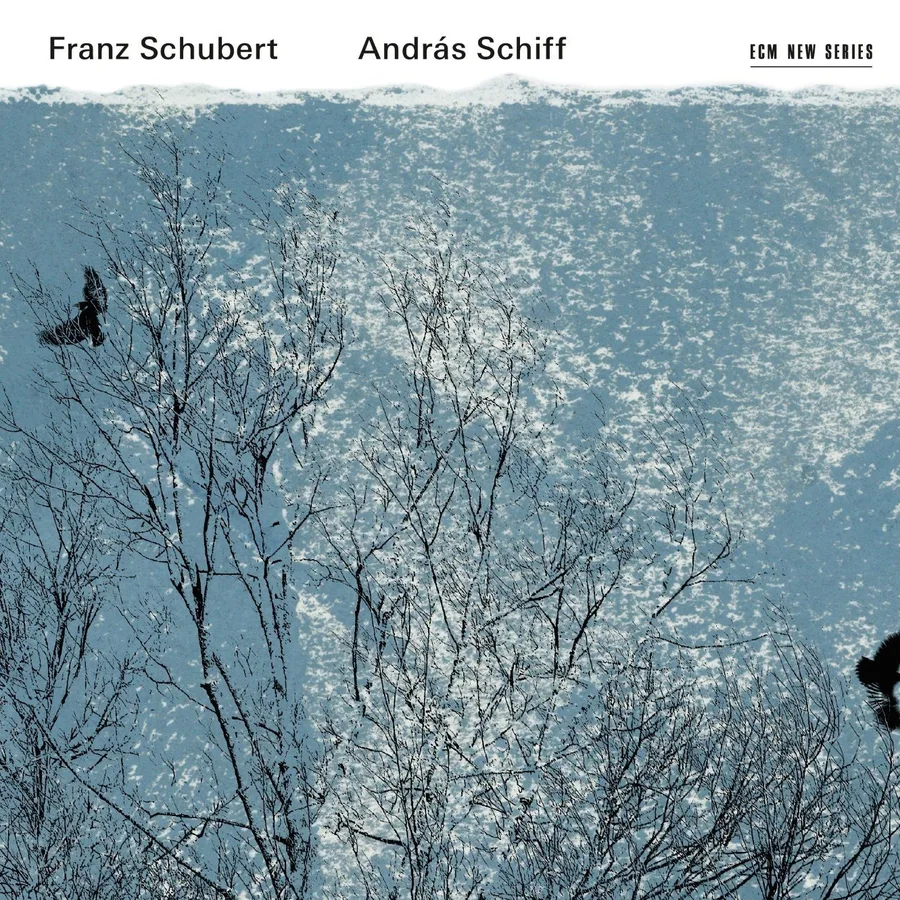
The sleeve for András Schiff's Schubert has no obvious link to the pianist or to the music. Frosted branches, a white sky, two black birds. Winterreise is in the air and never named. Nobody is told who took the photograph or where. In the top right corner, the small ECM New Series logo.
ECM New Series, the same silence for other music
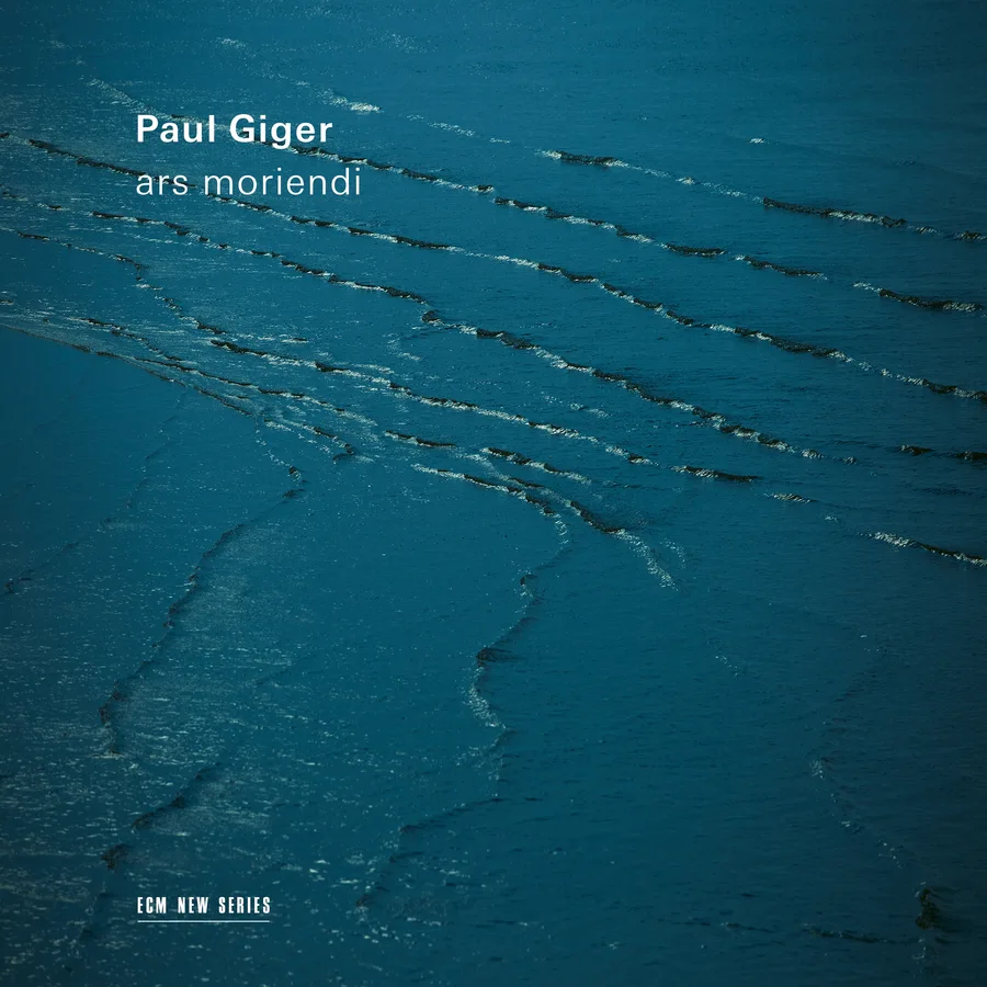
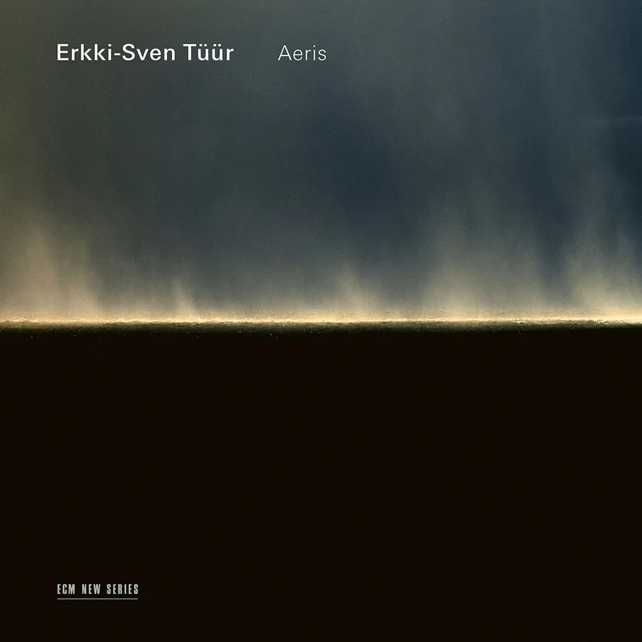
In 1984 Eicher launched ECM New Series, a sub-label for contemporary and classical music. Jan Garbarek had already crossed that line on the main catalog, recording with chamber ensembles. New Series brought in Arvo Pärt, Giya Kancheli, Sofia Gubaidulina, Heinz Holliger and Paul Giger.
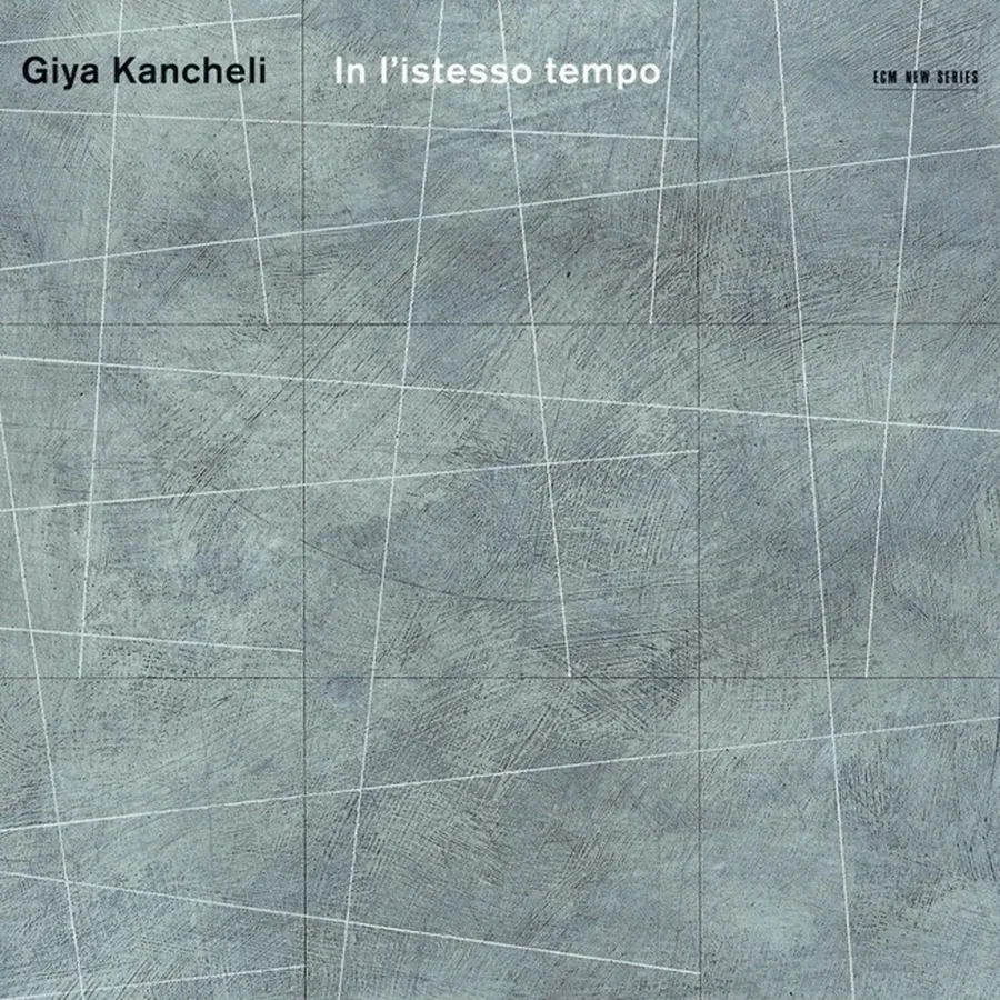
Seen side by side, the two series read as one world. The same economy of means, the same placement of type, the same mineral surfaces and grazing light. This comes from a shared sensibility. Nobody imposed a style guide.
Dieter Rehm, photography as transcription
From 1978 Dieter Rehm became the central figure of ECM's visual identity, as photographer and art director. His photographs transcribe more than they describe: horizons, water, diffuse light, geology pushed toward abstraction.
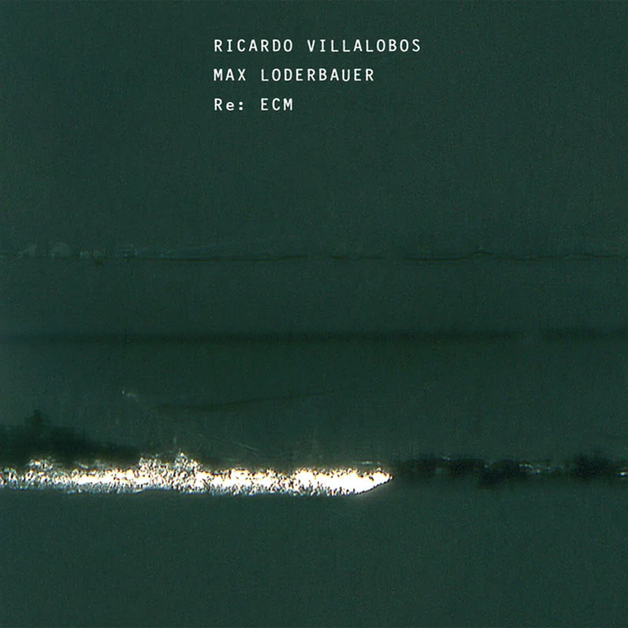
In 2011 Eicher handed the catalog over to Ricardo Villalobos and Max Loderbauer. The sleeve looks like a night seen from under water, and it is unmistakably ECM. The aesthetic works as a language rather than a cage, and a language can be learned by newcomers. The label's own page on Dieter Rehm's cover work covers nearly fifty years spent at Eicher's side.
Drawing as a score: Jacob Young
Not every ECM sleeve is a photograph. For Eventually, by the Jacob Young trio, the cover shows marks scribbled on bluish manuscript paper, with a diagonal stroke that could be a bow.
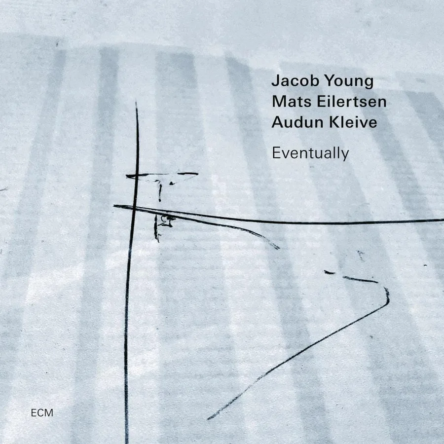
There is no redundancy in the catalog. The same image never appears twice. Each one answers a single record, and all of them resemble one another. That is what a language is: one grammar, endless different sentences.
Keith Jarrett in the American desert
Keith Jarrett's recording of C.P.E. Bach's Württemberg Sonatas. Eighteenth-century German music, an American performer. On the sleeve, a black-and-white photograph of a straight road crossing a desert, telephone wires, the cold light of midday. Nothing explains the choice. It fits all the same.

ECM declines to comment on its own records. Most sleeves illustrate the music or signal which tribe it belongs to. An ECM sleeve points in a direction and lets you walk there yourself. The images don't age, because they never carried a date. Eye magazine ran a long piece on the label's visual history, Think of your ears as eyes.
What ECM Records album covers teach anyone who works with images
The first lesson is economy. The second is that coherence comes from conviction, not from rules. Eicher never had a brand book. He had one standard, that images be chosen with the same rigor as the music, and he held to it for five decades and more than two thousand albums.
The other lesson is duration. ECM's visual identity lives in the whole catalog, not in any one sleeve. A cover from 2021 looks like a cover from 1974 because it belongs to the same family. It isn't imitating anything.
Takuya Studio designs record sleeves for independent artists and labels, convinced that an album's image deserves the same rigor as the music it comes with.