
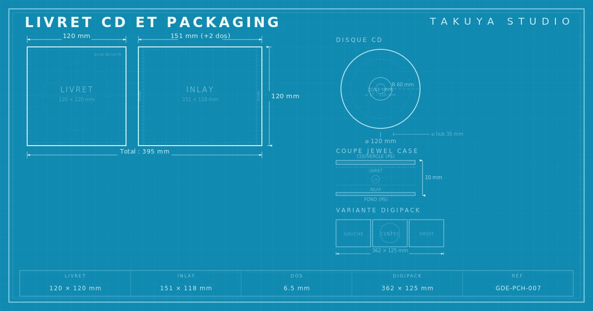
CD packaging is a system of several surfaces, each with its own size and its own print constraints. The diagram above lays the technical groundwork for CD booklet design: booklet, inlay, disc, digipak. Get these right before making a single graphic decision.
The CD as a design object
It's tempting to file CD booklet design away with the past, somewhere between the cassette and the MiniDisc in the museum of forgotten formats. That would be hasty. The compact disc is still a living format. In Japan, CDs still make up the majority of the music market, and independent labels in Europe and North America keep pressing them for tours and the merch table. Designing a finished record sleeve means mastering the constraints of the format you've chosen. The CD has a fair number of them, starting with dimensions many young designers discover too late.
CD packaging is not a shrunken poster. It's a three-dimensional object, and every face has its own size, fold lines and safe zone. The most common mistake is to treat the front as a lone square image and forget that the back, the spine, the booklet and the face of the disc form one visual system. Or should.
Standard jewel case dimensions
The jewel case, the clear plastic box invented by Philips in 1982, is still the most widespread format. Its dimensions haven't moved in forty years and leave no room for guesswork. The front inlay measures 120 × 120 mm. The back inlay (the tray card), which includes both spines, measures 151 × 118 mm: a 138 mm main panel plus two 6.5 mm flaps that fold around the tray to form the spine you see on a shelf. The booklet also folds down to 120 × 120 mm, but its flat size depends on the number of panels.
These numbers look harmless. They aren't. Shift the back flap by one millimeter and the spine text drifts off-axis, and the spine is what shows when the disc is filed away. Often it's the only thing anyone sees. Printers supply their own templates, but the core measurements never change. Allow 3 mm of bleed on every edge and keep critical text at least 5 mm from the trim.
Digipak and gatefold, the board alternatives
The digipak has largely replaced the jewel case at the premium end. The principle is simple: a rigid board case (typically 300 gsm cover board) with one or more panels and a molded plastic tray glued inside to hold the disc. The most common format is the 4-panel digipak (two front panels, a tray, a back panel). There are 6-panel versions for double albums, and asymmetric configurations too.
A standard digipak panel runs about 141 mm wide by 125 mm high, but those figures shift with the manufacturer and the spine thickness. That's the catch. Unlike the jewel case, whose measurements are universal, a digipak is built on the converter's exact template. Two printers will hand you slightly different templates, and switching from one to the other mid-production invites misalignment at the folds.
The board gatefold goes further. Borrowed from the vinyl gatefold sleeve, it opens two full panels like a book. The artwork area doubles, and the object gains presence, thickness, gravity. For an album conceived as a whole work (music, text and images together) the gatefold offers narrative room a jewel case simply can't.

Print specs for CD packaging: CMYK, resolution, paper
A file for offset printing is supplied in CMYK (cyan, magenta, yellow, black) at 300 dpi minimum at final size. That's a floor, not a suggestion. Below it, gradients break into pixels, fine type fills in and the print gives away every shortcut in the source file. The recommended ICC profile depends on the continent: Fogra39 (ISO Coated v2) in Europe, SWOP in North America.
The booklet paper changes how the whole object is perceived. A 150 gsm gloss coated stock gives sharp photographic rendering, saturated color and a smooth surface that catches the light, which suits photographic covers where detail matters. Matte coated stock cuts glare, softens contrast and feels gentler in the hand; it's often the choice for contemporary graphic work. Uncoated paper (offset, Munken and the like) soaks up more ink and narrows the gamut. In exchange it gives the object a tactile quality coated stocks never reach, a warmth closer to an art book than to a consumer product.
Special finishes add a layer of complexity to the budget and to the art direction. Spot UV varnish sets gloss areas against matte ones. Embossing presses relief into the board. Hot foil stamping lays down a metallic film in gold, silver or copper. Each of these needs its own separate file (a vector mask) and pushes the unit cost up noticeably. They earn their place when the design is built around them from the start, not when they're added at the last minute to "look premium."
The booklet as more than a lyric sheet
The inner booklet often gets treated as a formality. Squeeze in the lyrics, the credits, a portrait or two of the artist, done. It's a waste. An eight- or twelve-page booklet is an editorial space in its own right, able to unfold a sequence that runs alongside the listening. The order of the images, their pacing, the typographic pauses between two blocks of text: this is the same editorial thinking that goes into an illustrated book.
Look at the most memorable booklets of the CD era. Björk's, designed by M/M (Paris). Radiohead's, by Stanley Donwood. Those from ECM Records, whose photographic restraint became a reference point. They share one conviction: the booklet isn't an accessory to the album, it's part of it. The image order follows the track order. The grain of the paper answers the texture of the sound. The type breathes with the silences.
Printing the disc face
The printed face of the disc is a space people tend to neglect. Two techniques dominate. Offset printing gives photographic quality, smooth gradients and a wide color range; it's the industry standard. Screen printing (silkscreen) lays down thicker ink for dense flat areas and opaque colors, including white on the silver surface. It limits the palette, usually to between one and five colors, but allows effects offset can't produce, such as partial transparency that lets the metal of the disc show through.
The printable area of the disc is a ring. The outer diameter reaches 116 mm (bleed to 118 mm), and the inner diameter comes down to about 22 mm around the center hole. Between the two you still have to subtract the stacking ring, roughly 35 mm across, where the raised polycarbonate makes printing unreliable. Designing for a ring calls for a different approach than designing for a rectangle. The composition has to work in rotation, with no top and no bottom.
Why CD packaging still matters in 2026
Japan, the world's largest physical music market, still absorbs millions of CDs a year. Japanese limited editions, with their obi strip, bonus tracks and careful packaging, turned the compact disc into a collector's item. Meanwhile, independent labels such as Warp Records, Constellation and Erased Tapes keep releasing physical editions where the packaging is part of the artistic statement.
Then there's tour merch. A CD costs far less to make than a vinyl record, fits easily in a suitcase, and gives the listener something to carry home after a show. For an emerging artist it's often the first physical format within reach, provided the packaging lives up to the music. A generic jewel case printed on thin paper, holding a blank white disc, says the opposite of what the artist hopes to say.
The CD was never a glamorous format. It lacks the physical presence of vinyl and the nostalgia of the cassette, and it never had the weightlessness of streaming. That in-between position is exactly what makes it interesting to design for. It's compact enough to demand concision and physical enough to allow real work on paper and texture. It's also cheap enough that a graphic risk won't ruin anyone. Done well, CD packaging holds a remarkable visual density, a small format that forces you to think big.