

Step 1 — Why you need a technical guide before you begin
Designing a professional album cover takes more than a good image. The work joins an artistic intent to technical constraints that change with the medium, the genre and the audience. A finished cover holds up everywhere: on a phone screen, on a turntable, in a CD booklet, on a playlist page. Overlook one of them and the album's image is degraded somewhere.
This album cover design guide gathers what's useful to approach the work with method. It won't replace an art director's eye, but it lays the technical groundwork. Each section covers one aspect, from color psychology to the print template, by way of streaming specs.

Step 2 — Understand color and typography before you choose
The first reflex is to think about the image. That's a mistake. The first decision concerns the palette and the typeface. Every genre has grown its own codes: black metal doesn't look like modal jazz, and minimal techno doesn't look like hip-hop. Knowing the psychology of color and typography on an album cover helps you avoid visual misreadings, or set them up on purpose, which is another kind of control.
Step 3 — Design for streaming from the first sketch
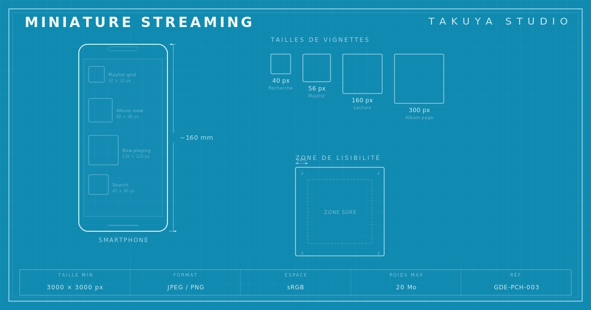
In 2026, most first encounters with an album happen on a smartphone. The thumbnail measures 40 to 56 pixels per side. At that size, detail goes, textures dissolve and thin typefaces stop being readable. The thumbnail problem on a phone gets solved in the first sketches, not at the end of the process.
Step 4 — Exact dimensions for each platform
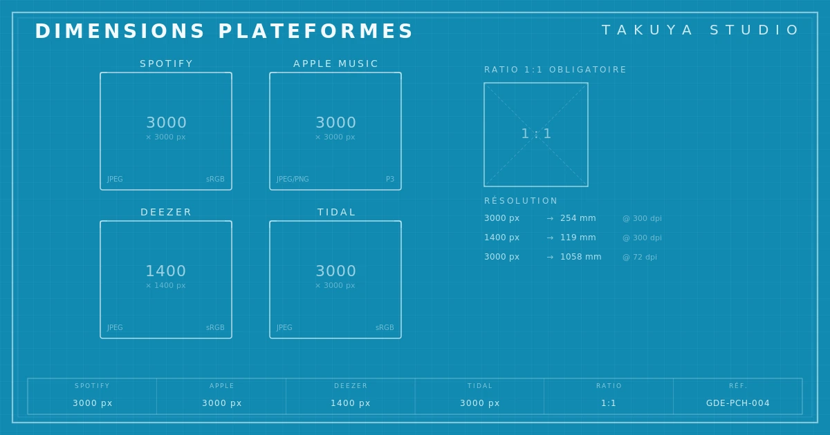
Spotify, Apple Music, Deezer and Tidal each have their own specs. The wrong format means automatic cropping, a loss of quality, or a file rejected at distribution. The specs also move over time: the album cover size Spotify requires in 2026 isn't the one it asked for in 2022. The image format Apple Music requires has its own quirks in color space and minimum resolution. Knowing the numbers saves costly back-and-forth with the distributor.
Step 5 — Beyond the thumbnail, the Spotify Canvas
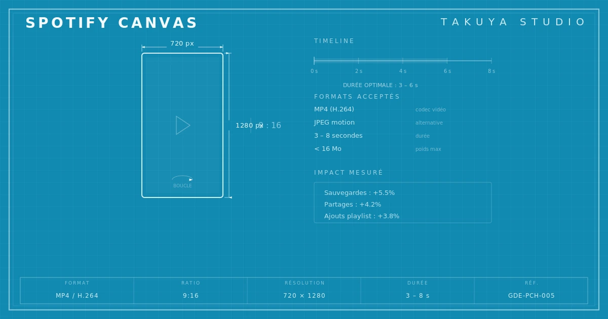
For a few years now, Spotify has let artists attach a vertical video loop of a few seconds to each track: the Canvas. Halfway between video and motion design, it has become a way to be noticed, and plays with a Canvas lead to more shares, saves and playlist adds. Making a professional Spotify Canvas calls for its own know-how. It is neither classic video nor static graphics but a mix with rules of its own.
Step 6 — Vinyl isn't dead, and neither is its template
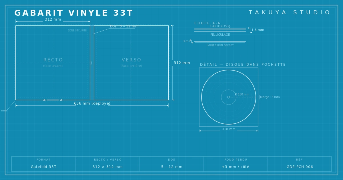
The vinyl market has been growing for fifteen years. In France, LP sales passed one million units in 2024. For a pressing, the 12" vinyl LP cover template is not up for negotiation. Safe areas, fold zones, spine, back cover: every measurement is exact and changes with the number of discs. A few millimeters off and the pressing can't be used.

Step 7 — The CD booklet and physical packaging
The CD hasn't disappeared. It is the most widely sold physical format in Japan, it still brings real revenue to European independent labels, and it's often the first tangible object an emerging artist can offer. CD booklet and packaging design requires a close understanding of short-run offset printing: jewel case, digipak, card gatefold, each with its own fold, margin and color constraints.
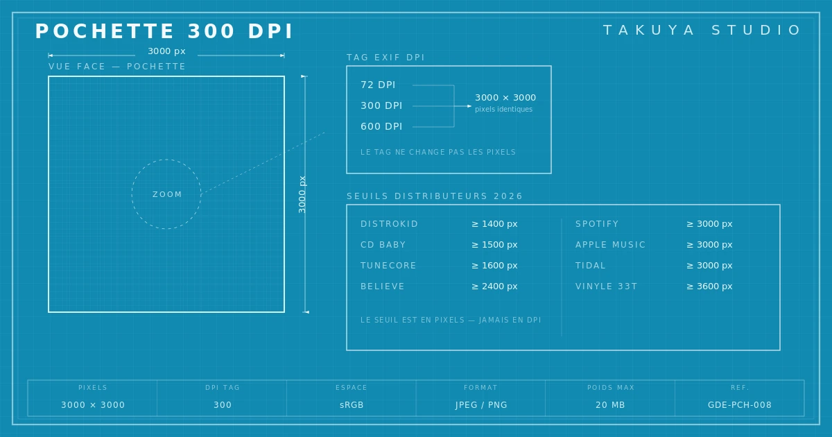
Step 8 — The 300 DPI trap and low-resolution warnings
Of all the misunderstandings, the confusion between the DPI tag and real resolution is by far the most common. An artist delivers a file marked "300 DPI", thinks they've met the professional standard, and gets a "low resolution" warning. It isn't a bug. The file simply lacks pixels, whatever its EXIF tag says. The 300 DPI question on an album cover deserves a closer look, because it regularly stalls self-released artists who thought they'd done everything right.
Conclusion — The integrated approach: think about every format at once
The classic trap is to design for one medium and adapt for the others afterward. The result is almost always weak. The professional approach runs the other way: build a visual system sturdy enough to work at every scale and on every medium, from 3000 × 3000 pixels to 312 × 312 mm. Composition, type and palette are tested at thumbnail size and at full size together. That discipline is what separates amateur cover design from art direction.