

Barney Bubbles, a ghost in design history
His work runs across three decades of British music, from psychedelia to punk, from pub rock to new wave. His name is on none of it. No credit, not even a set of initials. Colin Fulcher, known as Barney Bubbles, declined to sign what he made, and the refusal bought him decades of oblivion. Barney Bubbles album covers sit in every serious British record collection of the period; the man himself barely shows up. Of all the album cover designers who took the biggest risks with a record's face, he is the one history took longest to find again.
Fulcher was born on 30 July 1942 in Tranmere, on Merseyside, and studied at Twickenham College of Art in the early 1960s. There he soaked up the Bauhaus, Russian constructivism, Jugendstil and De Stijl, a repertoire he would spend the rest of his life hijacking and rearranging. Most designers end up settling into a style people can spot. Bubbles went the other way. Each job broke with the one before, and each sleeve was a disguise. Leaving his name off was less a pose than the logical end of a practice built on changing shape.
Hawkwind, psychedelia as a laboratory
His first important sleeves came out of Hawkwind's orbit, the space rock band whose unofficial art director he became at the turn of the 1970s. In Search of Space (1971) shipped with a fold-out booklet of his design: a three-dimensional object, printed on both sides, crammed with collage, skewed type and references to science fiction and the occult. Space Ritual (1973) went further, with a fold-out sleeve where the artwork spills past its edges and the line between cover and contents stops meaning much.
Already, Bubbles treated the sleeve as a thing in its own right, one that talks back to the music instead of picturing it. The In Search of Space booklet doesn't depict Hawkwind's sound. It carries the experience on by other means. That idea survives intact through everything he did later, even after the look changed completely.
Stiff Records and the punk turn
The swerve came in the mid-1970s, when Bubbles joined Stiff Records, the independent label Dave Robinson and Jake Riviera founded in 1976. Punk demanded the look of urgency: cut-ups, photocopies, crude type. Bubbles adapted with disconcerting ease. The man of the psychedelic murals was suddenly turning out nervy, cutting graphics, as if he had always done so. Often under a pseudonym, often with no credit at all, he designed sleeves for Ian Dury & The Blockheads, Elvis Costello, The Damned and a dozen other acts on the roster.
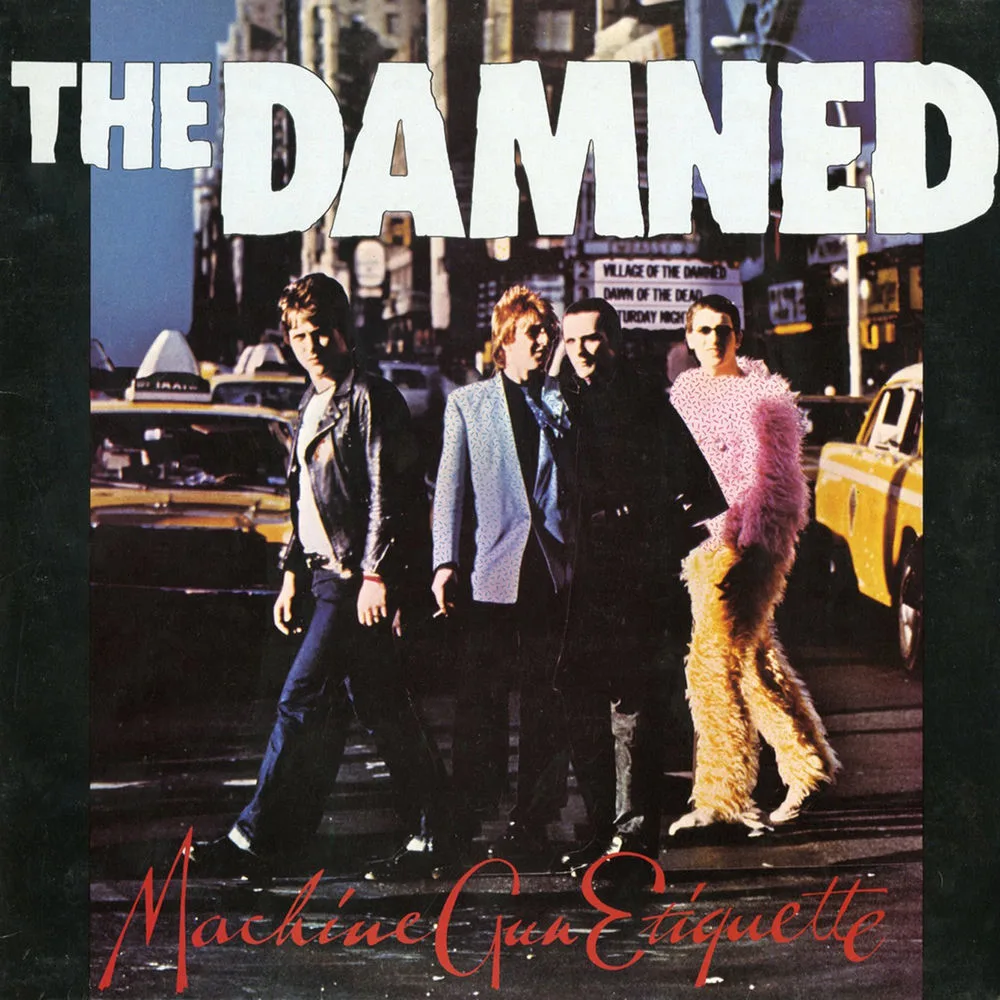
For The Damned's Machine Gun Etiquette (1979) he built a dense montage that owes as much to Soviet agitprop as to American pop art. It looks brutal. It isn't. Angles, stacked type, the weight of each mass against the others: the sense of something thrown together in a hurry is the result of very careful work.
Armed Forces, constructivism as a pop weapon
The sleeve for Elvis Costello's Armed Forces (1979) is probably his most quoted piece. It takes the vocabulary of Russian constructivism (angular geometry, flat bright color, type used as structure) and turns it around. The album's title, with its military overtones, gives the borrowing a satirical edge, and Bubbles plays it with real intelligence. The propaganda poster becomes pop art. The political slogan becomes a song title.
What keeps it from pastiche is how completely he owns his sources. This is a rewrite from the ground up, by someone who knew El Lissitzky and Rodchenko as well as he knew the Ramones. That double culture, the historical avant-garde on one side and mass culture on the other, is the key to everything he made.
Do It Yourself, thirty sleeves for one album
If a single sleeve had to stand for Barney Bubbles, it would be Ian Dury & The Blockheads' Do It Yourself (1979). The principle is simple. Copies came dressed in different wallpapers, around thirty Crown Wallpaper patterns in all, so two people buying the record on the same afternoon could walk out with two different objects.

The gesture is funny, a little poetic, and conceptually dizzying. It takes apart the idea of the sleeve as a fixed image and makes each copy its own piece. It also plays on the double meaning of the title, home improvement, the Sunday afternoon spent papering the back bedroom, with a tender irony that suits Dury's cockney humor exactly. The design doesn't comment on the music. It finishes it, the way one joke can finish another.
Erasure, as method and as tragedy
Barney Bubbles took his own life on 14 November 1983, at forty-one, in his flat in Acton, west London, after years of depression made worse by money troubles and the feeling that the music business had moved on without him. His death went almost unnoticed. He left no public portfolio, no organized archive, no retrospective book. Not signing had done exactly the damage one might have feared.
It took Paul Gorman's book Reasons to Be Cheerful: The Life and Work of Barney Bubbles (2008, revised edition 2010), then the Chelsea Space exhibition in London in 2012, for the name to come back. The rediscovery was slow, carried by collectors, design historians and musicians who remembered a man able to change his whole visual identity from one commission to the next. There is broad agreement now that he is the most underrated sleeve designer in the history of recorded music. It arrived too late to reach him.
Takuya Studio designs record sleeves for independent artists and labels, on the same principle: an album's image deserves the same care as the music it comes with.