
A name written into the texture of the sound
Some sleeves can be recognized before you've read a single letter. Not by a logo, a typeface or a recurring motif, but by a sensation: something earthy, slightly eroded, troubling in its beauty, as if the image had been dug up instead of made. That signature, which thousands of alternative music fans carry around without putting a name to it, belongs to Vaughan Oliver. Among the great art directors of the record sleeve, he is the craftsman who preferred organic ambiguity to instant legibility.
Born in 1957 in Sedgefield, County Durham, Vaughan Oliver studied graphic design at Newcastle upon Tyne Polytechnic before joining 4AD in 1981. He never really left. For more than twenty years, under his own name, as 23 Envelope with photographer Nigel Grierson, then as v23, he designed almost every sleeve in the catalog: Cocteau Twins, Pixies, This Mortal Coil, Dead Can Dance, Throwing Muses, Lush, Pale Saints, His Name Is Alive, the Wolfgang Press. Every record is a world, every image a surface you want to touch.
Vaughan Oliver and 4AD, a label you could know with your eyes shut
What Oliver did for 4AD goes beyond art direction. He built a visual language that held from one record to the next and was different every time. You can spot a 4AD record at first glance without being able to point to a single recurring element: no imposed logo, no grid, no palette. What links the sleeves is an attitude toward matter. Photographs altered, scratched, overexposed. Type on the edge of legibility. Layered textures, mineral, vegetal, bodily.
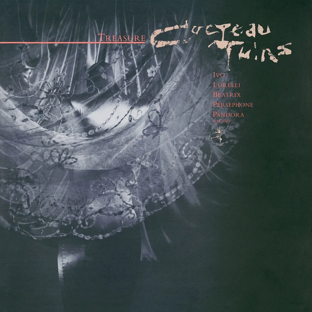
The label's founder, Ivo Watts-Russell, left him entirely free. Oliver listened to the records, sometimes only the demos, and made work in response. He didn't ask bands what they wanted; he showed them what he had heard. When Cocteau Twins first saw the Treasure sleeve in 1984, with its gilding and its almost biological shapes, they recognized their music in it better than they could have described it themselves. Translating sound into touch, timbre into texture, was his particular gift.
Simon Larbalestier and the making of unease
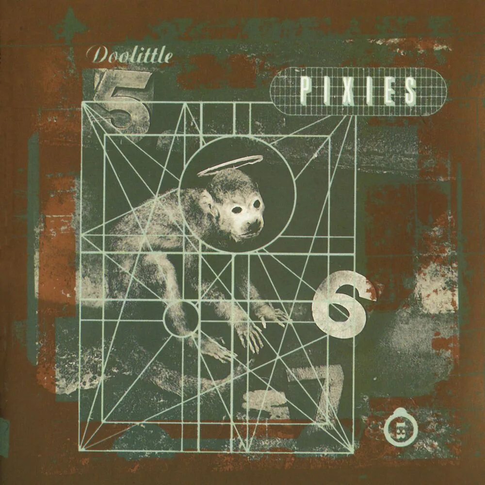
In the late 1980s Oliver found a new accomplice in the photographer Simon Larbalestier, and in 1988 he and Nigel Grierson went separate ways. Together Oliver and Larbalestier made the Pixies sleeves, Surfer Rosa, Doolittle, Bossanova, Trompe le Monde, one of the most coherent visual bodies of work in alternative rock. Larbalestier photographed objects, bodies and ambiguous forms with clinical precision. Oliver cropped, layered, desaturated, bent the type. The result isn't surrealist in the painterly sense. It is closer to an infra-realism, the real nudged slightly off true, made barely recognizable.
Doolittle is the best-known example. A monkey in profile, ringed with a halo, on a worn, stained ground. The image tells nothing literal. It sets a mood, like Black Francis's songs, where violence and tenderness sit side by side without explanation. Oliver liked to cite the films of Luis Buñuel and the paintings of Max Ernst, an influence of structure more than style: like them, he set familiar elements in arrangements that resist interpretation.
This Mortal Coil, the quiet masterpiece
If one object had to sum up his work, it might be the sleeve of It'll End in Tears (1984), the first album by the collective project This Mortal Coil. A black-and-white photograph, a closed face, eyes shut, skin grained like stone. The framing is tight, almost oppressive. The type, pushed to the margin, seems printed on a different plane from the image. The whole has a funereal beauty that the title confirms without weighing it down.
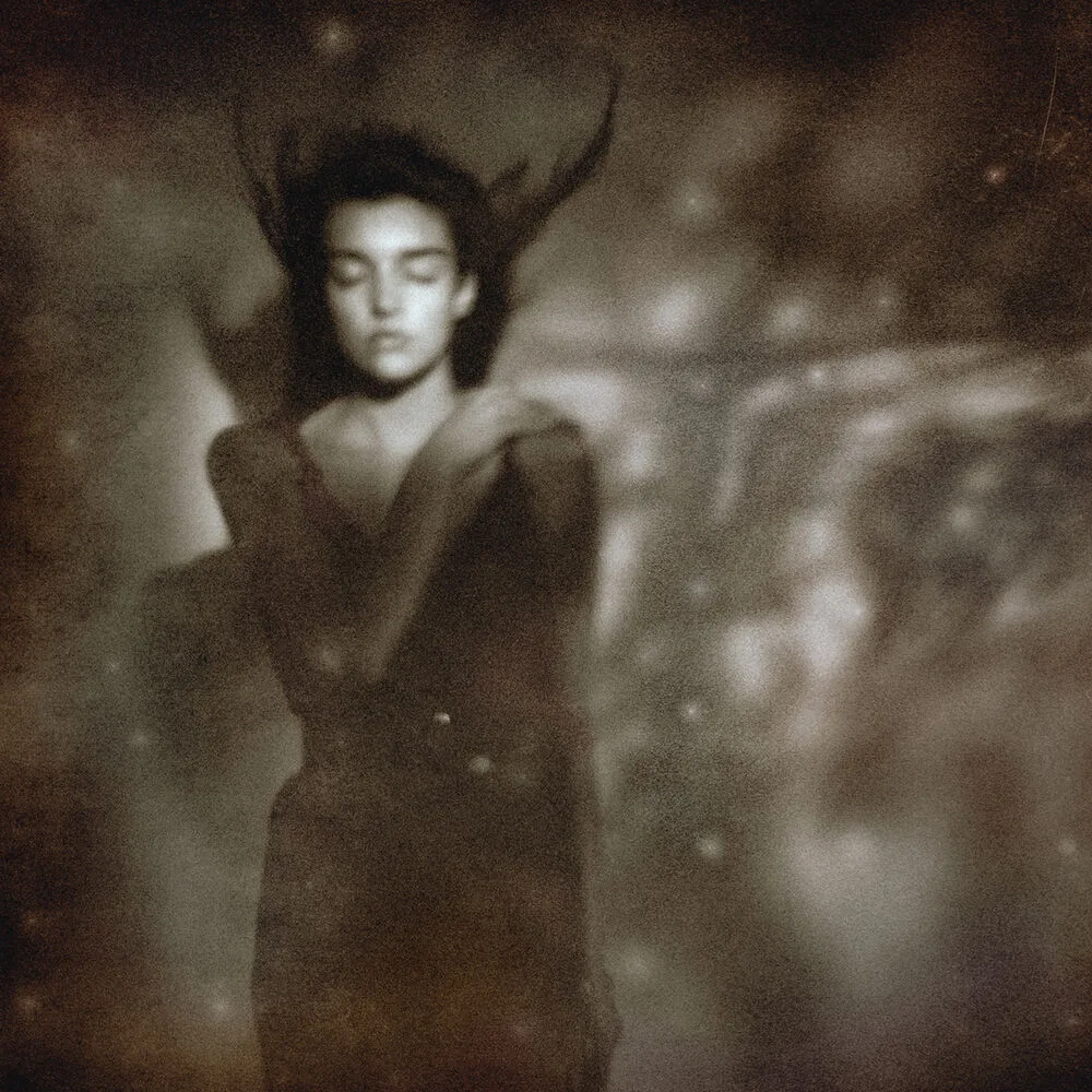
The record, which Ivo Watts-Russell put together from cover versions and new pieces performed by the label's artists, has no equivalent in independent music. The sleeve extends it: a collage of emotions with no story, fragments held together by atmosphere alone. Working for a project that never meant to be a band, and was never meant to last, may have freed Oliver from any commercial temptation. The image has nothing to sell.
Typography as noise
His relationship with letters is often underrated. Where most designers of the period went for legibility, or for punk chaos, Oliver found a third way: type as sonic texture. His letters are often masked, distorted, melted into the photographic matter until they can't be separated from it. On sleeves for Dead Can Dance or Throwing Muses the words seem to rise out of the ground rather than sit on it. They add to the unease instead of resolving it.
The approach was foreign to music-industry conventions but close to the British postmodern graphic design of the 1980s. Oliver cared less about clear communication than about the experience of perception. Looking at a 4AD sleeve means decoding as much as admiring.
An influence without imitators
Vaughan Oliver died on 29 December 2018, aged sixty-one, with relatively little fuss. His influence is considerable all the same, and hard to trace. He founded no school, published no manifesto, taught no method anyone could repeat. What he left is a permission, the proof that a sleeve can work outside any marketing framework, through its material presence alone. The Visceral Pleasures exhibition at the University for the Creative Arts took the measure of it: hundreds of sleeves in a row, a volume of output few designers have reached in so personal a register.
Independent design owes him more than it admits. Anyone who uses damaged textures, layered photographs or altered type in a musical context today is drawing on a vocabulary Oliver invented. Imitating him is still impossible, because his method was sensory, not formal. He started from a sound to be made tangible, never from a concept to illustrate. Turning a timbre into grain, a reverb into depth of field, a breath into surface erosion is not something you can codify.
Takuya Studio designs record sleeves for independent artists and labels, on the same principle: an album's image deserves the same care as the music it comes with.