
Artists, not suppliers
For most of the industry's history, the album cover has been packaging: a surface to fill, a marketing message, a box to tick before release. A handful of people refused to see it that way. The best album cover designers treated the sleeve as a work in its own right, and built bodies of work that run alongside the music and still stand up when no note is playing.
Three names come first. Storm Thorgerson, Peter Saville and Stanley Donwood are all British, but they belong to different decades and work in almost opposite ways. Thorgerson photographed the impossible, for real, without trickery. Saville took things away until only what mattered was left. Donwood painted the music without ever trying to depict it. Each kept working with the same bands for years, sometimes decades, and each produced images that have outlived the records they were made for. Vaughan Oliver, Stefan Sagmeister and Barney Bubbles complete the picture.
Storm Thorgerson, reality doctored
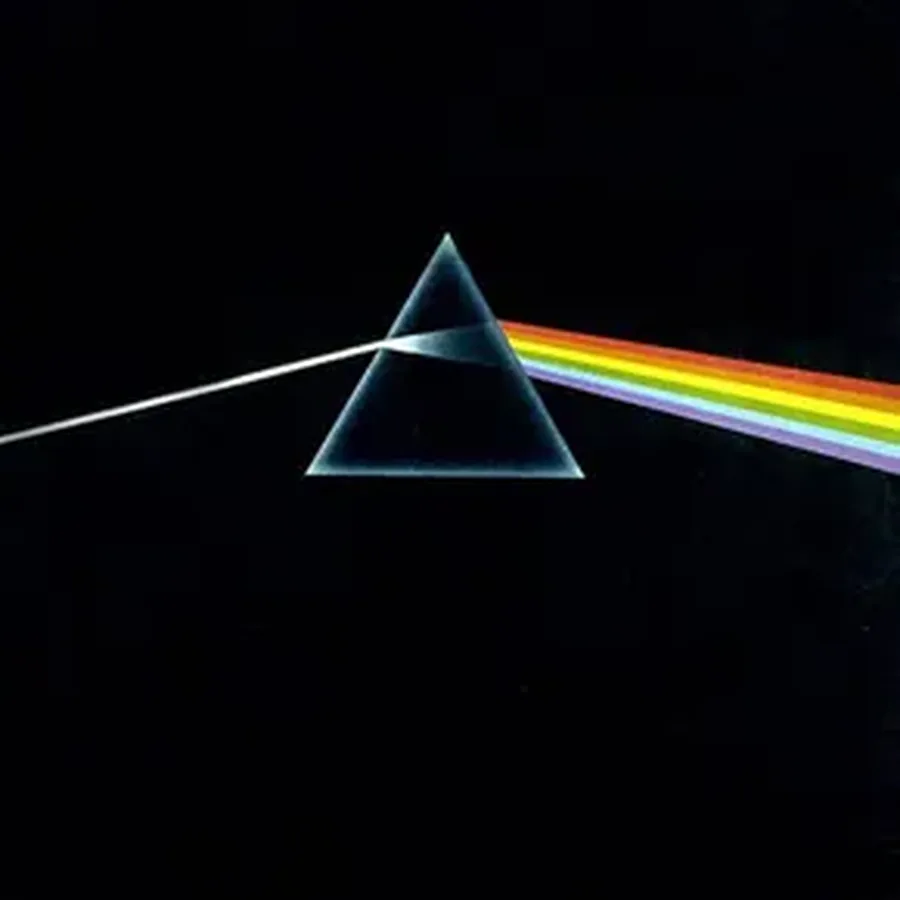
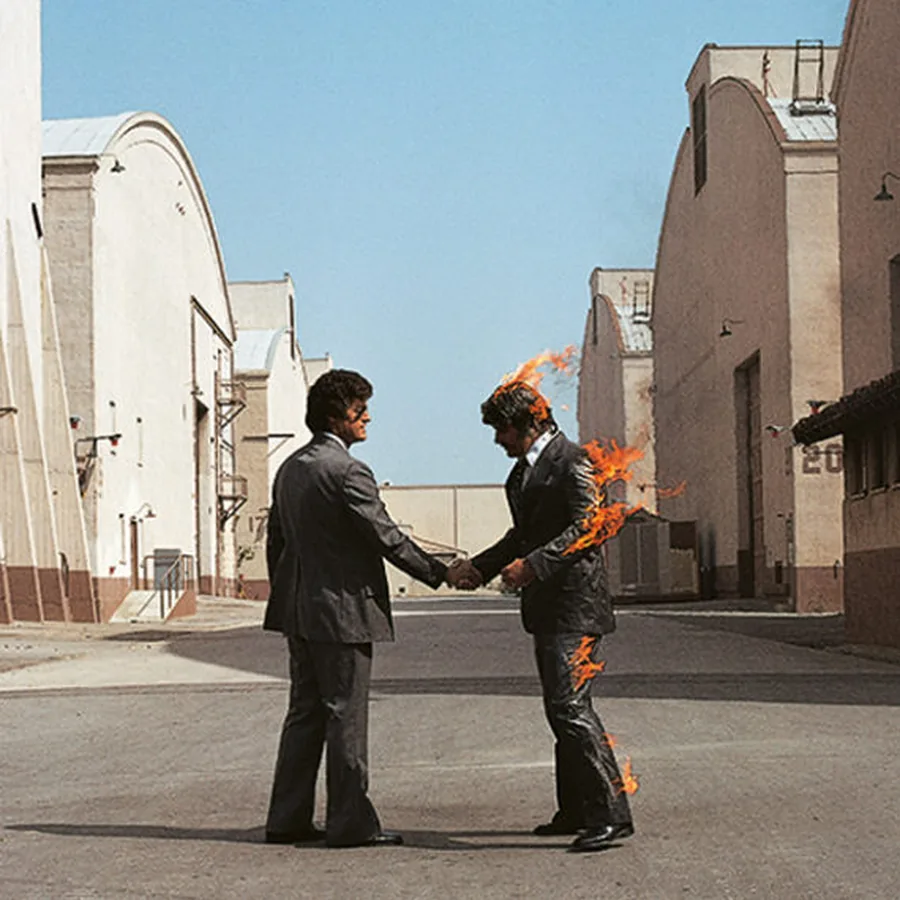
Storm Thorgerson founded Hipgnosis in 1968 with Aubrey Powell, and for decades the studio shaped most of Pink Floyd's visual history, from the prism of The Dark Side of the Moon to the metal heads of The Division Bell. His method was to stage scenes for real: a stuntman actually set on fire, hospital beds lined up on a beach, sculptures put up in a field in Cambridgeshire. Fifty years on, the images haven't worn out. Thorgerson had studied philosophy, and he approached each brief as a conceptual problem waiting for a solution.
More on Storm Thorgerson →Peter Saville, design by subtraction
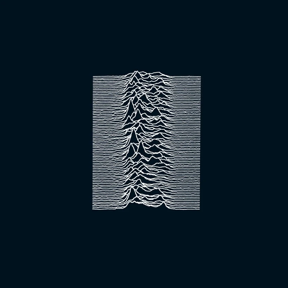
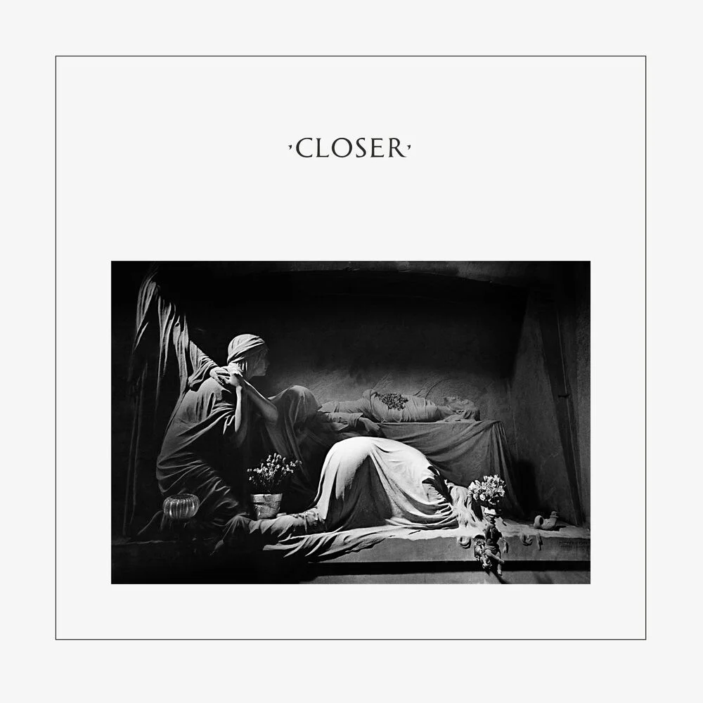
Peter Saville was Factory Records' designer from the label's founding in 1978. His approach consisted of removing everything the industry considered compulsory. No band name on Unknown Pleasures, no title on Power, Corruption & Lies. Closer, with its marble tomb, was chosen before Ian Curtis died. The less information Saville's sleeves give, the more they say. In 2014 his work entered the permanent collection of MoMA.
More on Peter Saville →Stanley Donwood, painting as a parallel territory
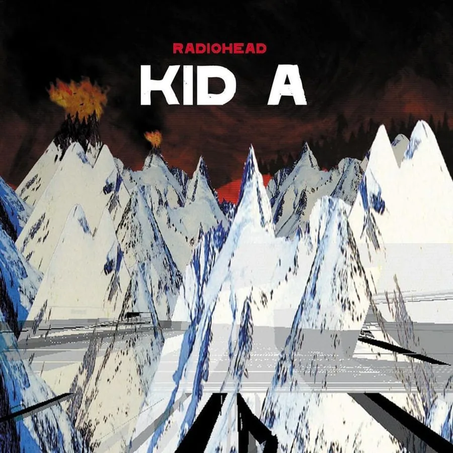
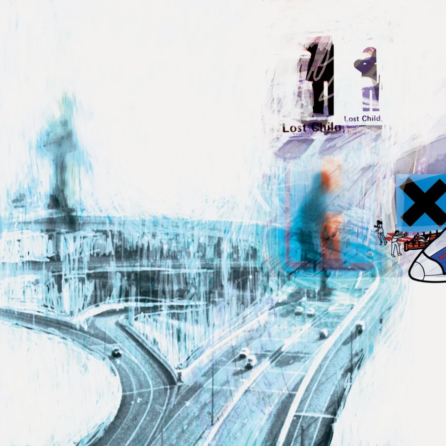
Stanley Donwood has made all of Radiohead's artwork since 1994. He is a painter more than a graphic designer. The burning landscapes of Kid A, the maps of anger in Hail to the Thief, the chromatic blasts of In Rainbows. He paints in a warehouse while the band records next door, and the work is born under the same conditions as the music. Thirty years of collaboration, a Grammy in 2009, a retrospective at the Ashmolean Museum in Oxford.
More on Stanley Donwood →Vaughan Oliver, graphic design as organic matter
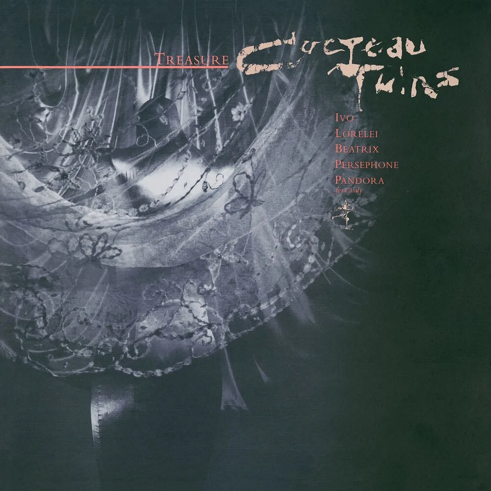
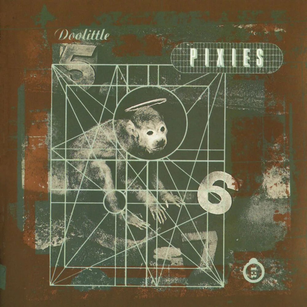
For more than twenty years Vaughan Oliver was art director at 4AD, and his work made the label recognizable at a glance: you knew a 4AD record before you'd read the name on it. Cocteau Twins, Pixies, This Mortal Coil, Dead Can Dance, Throwing Muses. His sleeves rely on texture rather than illustration, on matter rather than sign. He worked first with photographer Nigel Grierson as 23 Envelope, then under the name v23.
More on Vaughan Oliver →Stefan Sagmeister, the body as medium

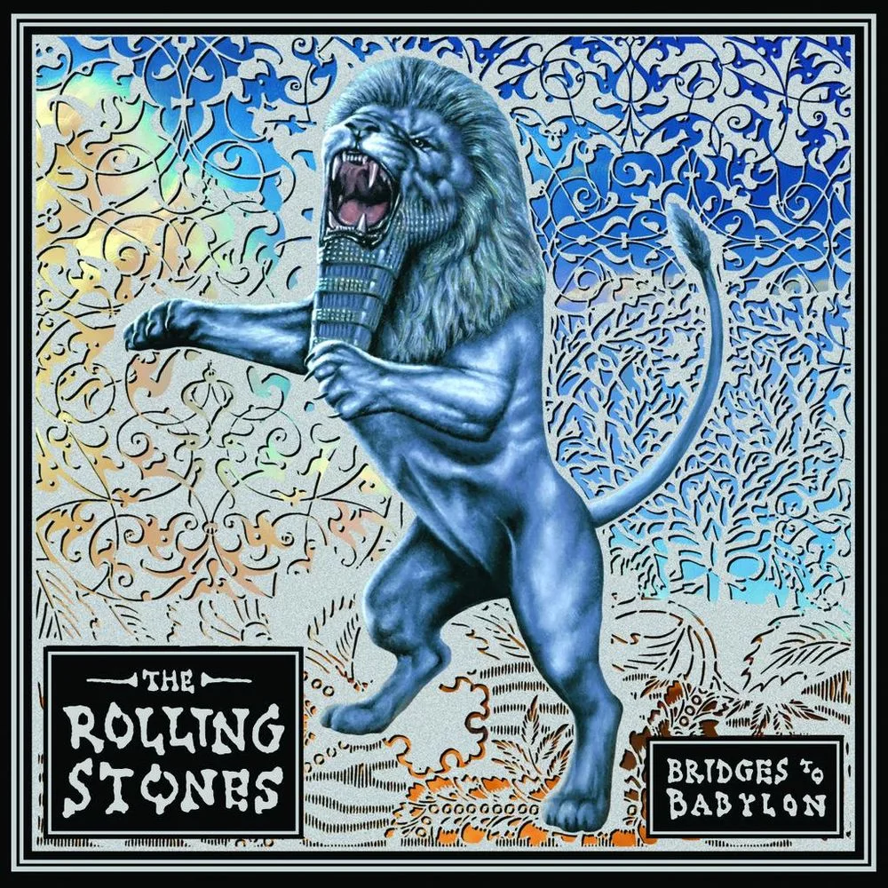
Stefan Sagmeister, born in Austria, brought a physical dimension to the record sleeve that few had tried before him. He once had type cut into his own skin. He designed sleeves for Lou Reed, the Rolling Stones (Bridges to Babylon) and David Byrne (Feelings), and has won the Grammy for best recording package twice. Based in New York since 1993, he pairs provocation with strict formal discipline.
More on Stefan Sagmeister →Barney Bubbles, the ghost of punk graphics
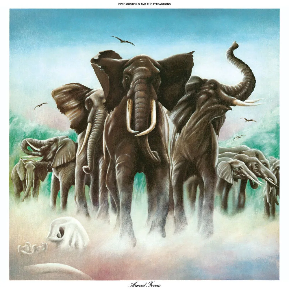
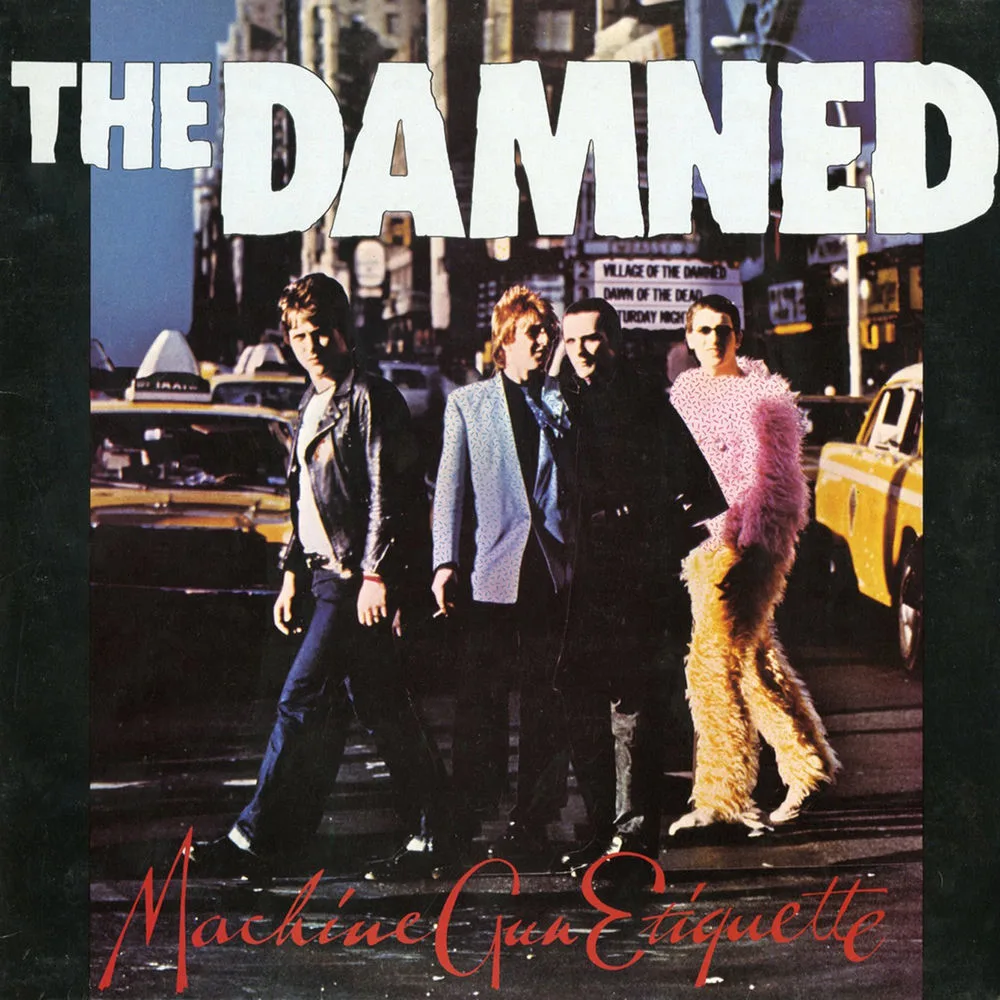
Barney Bubbles, born Colin Fulcher, designed some of the most inventive sleeves of the punk and new wave years, Armed Forces, Machine Gun Etiquette and Do It Yourself among them, without signing any of them. His style changed with every project: constructivism, De Stijl, pop art, psychedelia. He refused to put his name on his work the way others refuse to compromise. He died in 1983, at forty-one, and was rediscovered through Paul Gorman's book and the exhibitions that followed his death.
More on Barney Bubbles →What the best album cover designers share is time
Storm Thorgerson worked with Pink Floyd for twenty-five years. Peter Saville with Factory for fourteen. Stanley Donwood has been with Radiohead for thirty, and Vaughan Oliver stayed at 4AD for more than twenty. That is the opposite of a sleeve farmed out at the last minute. Duration builds trust, and trust is what allows risk.
The Victoria and Albert Museum in London holds sleeves by Thorgerson and Saville in its collections, part of a shift that has been under way since the first Hipgnosis exhibitions in the 1970s. For anyone designing or commissioning a sleeve today, these designers work as a compass. Nobody should try to make Dark Side again. What they show is that strong art direction is no luxury. It is a discipline, and it applies at any scale.
Takuya Studio designs record sleeves for independent artists and labels, convinced that an album's image deserves the same rigor as the music it comes with. Two labels held that standard across an entire catalog: Blue Note and ECM Records.