
Stanley Donwood, a name nobody knows, an image nobody forgets
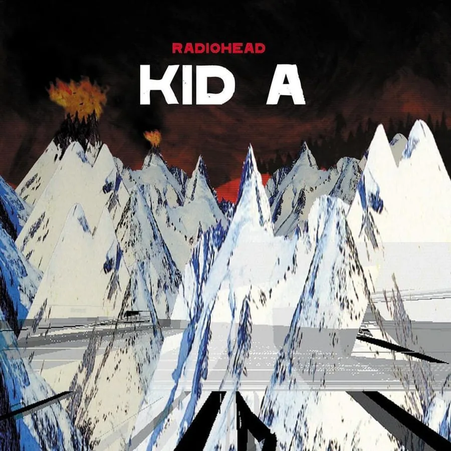
Ask people who made the cover of Kid A and most won't know. White peaks, orange light, a black ground. The image has gone round the world; its author is still largely unknown outside Radiohead's circle. Stanley Donwood shares one conviction with the best album cover designers: the image belongs to the music, not to the person who made it.
Stanley Donwood is the pseudonym of Dan Rickwood, a British artist born in 1968. He met Thom Yorke when both were art students in Exeter. Since the My Iron Lung EP in 1994 he has made the images for every Radiohead studio album from The Bends onward, along with dozens of singles and limited editions. No band of that size has kept that kind of continuity with a single artist.
The image as territory, not decoration
Donwood's sleeves don't illustrate the music. They live inside it. The difference is one of kind, not degree. Most album covers work like posters: you get them before you've heard a note. Donwood's give themselves up slowly.
You go back between listens and find what the first two looks missed: a sign in a landscape, a figure hidden in the lettering, a color that seemed out of place until it found its reason.
This isn't complexity for its own sake. It's the density of work made to last, not rushed out for a release date.
OK Computer (1997), chaos as a system
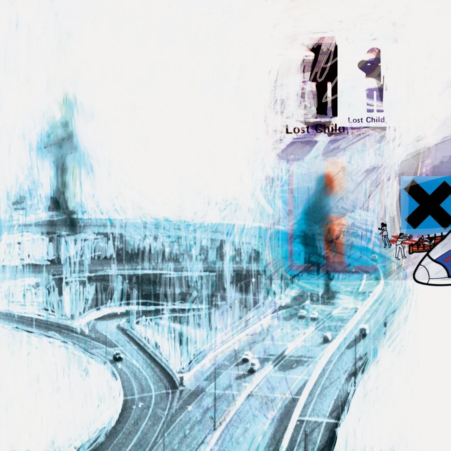
For OK Computer, Donwood gave himself one rule: no Undo key. Mistakes stayed in. Layers were scratched back to white. He has described the result as a fractured collection of things that were insignificant, forgotten, thrown away or neglected. The approach anticipated an idea digital art would take up later, that blur can be a form of truth.
Motorway interchanges, city grids, blocks of text you can't read. Nothing is exactly figurative, and everything gives the feeling of a city saturated with information. It was painted in 1997, with the tools of 1997, without nostalgia and without prophecy.
Kid A (2000), painting as emotion
After OK Computer, Radiohead took its most radical turn, toward electronic music. Donwood rented a disused warehouse in Bath and painted at night on large canvases, with the music in progress playing in the background. He has said, in substance, that it's hard to look at those paintings without hearing the music, because it is in them, encoded.
The Kid A sleeve may be his most loved. Mountains that burn without being consumed. A red horizon that is neither sunrise nor sunset. The painting was made in the same conditions as the music, and the two are better understood as two works born from the same state of mind, at the same moment, in two different languages.
Few images in the history of the record carry that much emotional force. This isn't illustration. It's painting, made in the conditions of the music it goes with.
Hail to the Thief (2003), anger mapped
Hail to the Thief came out in the wake of the Iraq war. Donwood answered with a map-canvas of words: road signs, newspaper headlines, advertising slogans, laid out like a street plan with Los Angeles as the model.
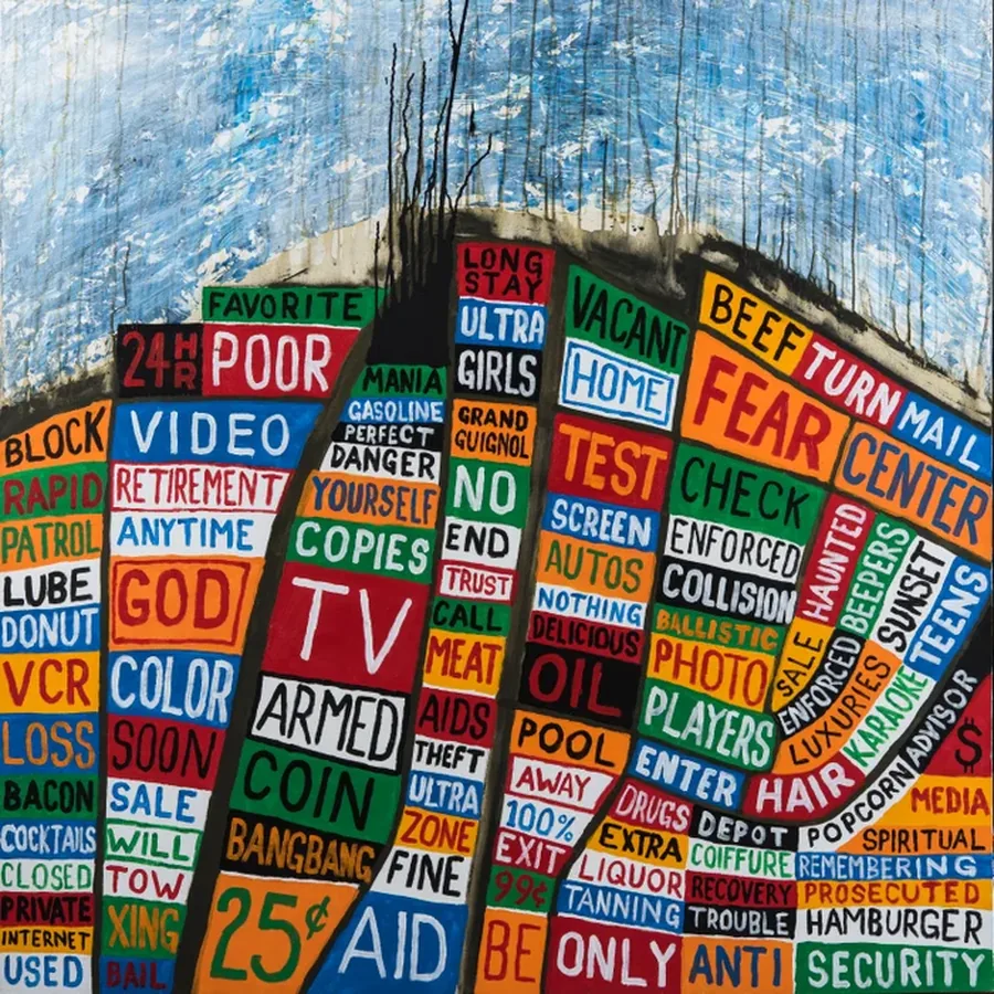
He refuses the easy metaphor. No bombs, no flags. What he shows is the texture of the world that produces wars: overload of signs, saturated meaning, absurdity made normal in public space. BEEF TURN MAIL. FEAR CENTER. GOD. TV. ARMED. The words state rather than accuse. The palette is limited to black, white and five colors, a constraint at a moment that would have justified excess.
In Rainbows (2007), the one time he let go
For In Rainbows Donwood first wanted to draw shopping malls like cathedrals, ringed by housing estates. The music went somewhere else, more physical, almost sunlit, and he followed it.
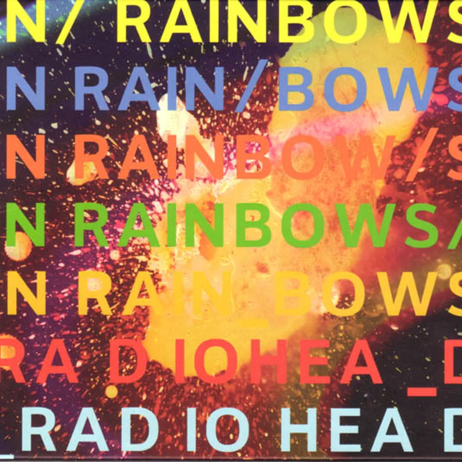
Melted wax and syringes produced the chromatic explosions on the sleeve.
The colors saturate, run, spurt. It is his most joyful sleeve, the one place he allows himself lightness, and people are fond of it for that: a register nobody knew he had, still recognizable at first glance. The Grammy for Best Special Limited Edition Package, won in 2009, confirmed it from the outside.
His influences: the old masters
His visual culture is a surprise next to 1990s rock. No counterculture graphic designers, no pop artists. Instead Caspar David Friedrich and his solitary figures before crushing landscapes, Hieronymus Bosch and his swarming creatures, military maps and their cold beauty, war museums and their archives of ordinary horror.
From Friedrich, Donwood takes the Rückenfigur, the figure seen from behind facing something bigger than itself. He changes the scale: the landscape becomes cities, motorways, political maps. What crushes us is no longer nature but the world we have built. That shift makes his work contemporary without visible effort.
He also works in linocut. In 2006 he showed London Views at the Jealous Gallery, fourteen linocuts of London landmarks wrecked by flood and fire. Linocut is slow and irreversible. There is no undo there either.
What his work teaches about the album cover
The best sleeve has a life of its own. You could hang it on a wall.
Few music visuals pass that test; out of context, they lose their interest. Donwood's hold. In 2021 the Ashmolean Museum in Oxford put that to the test with This Is What You Get, showing his work on its stone walls. The record had only been the first place it was shown.
His site, Slowly Downward, gathers paintings, prints, editions and books. The whole is coherent and dense, like the work of artists who don't make images to answer briefs but look for the most exact format for what they have to say.
Takuya Studio designs record sleeves for independent artists and labels, on the same principle: an album's image deserves the same care as the music it comes with.