
The image that swallowed its author
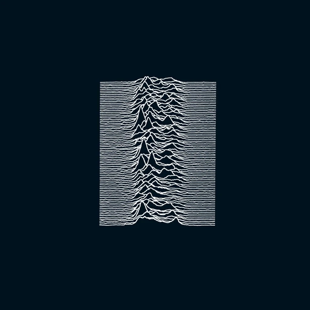
No title. No band name. No logo. In 1979, Joy Division's debut album came out in a black sleeve printed with eighty white lines, and Peter Saville, then in his early twenties and fresh out of Manchester Polytechnic, had just made one of the most copied images of the century without anyone needing to know his name. If you want to understand what makes a great album cover designer, start here.
The lines are radio pulses from the pulsar CP 1919, plotted in astronomer Harold Craft's thesis from data gathered at Arecibo in 1970. Stephen Morris, the band's drummer, came across the diagram in The Cambridge Encyclopaedia of Astronomy. Saville reversed it, white on black, and stripped out every word. In 1979 that amounted to a declaration.
Peter Saville and Factory Records, design as a condition
Factory Records, founded by Tony Wilson in Manchester in 1978, was never just a label. It was a cultural project in which design counted for as much as the music. Every release got a catalog number, FAC, and so did things that weren't records at all. Saville had a budget and, more importantly, freedom.
Take Blue Monday (FAC 73, 1983). The 12-inch came in an oversized die-cut sleeve shaped like a floppy disk, carrying a color code Saville had invented. It cost more to make than it sold for, so Factory lost money on every copy. Wilson didn't ask for a single change.
Closer (1980), the tomb before the tomb
Closer came out on 18 July 1980, two months after Ian Curtis took his own life. The cover shows the Appiani family tomb in the Staglieno monumental cemetery in Genoa: a marble Christ surrounded by mourners, photographed by Bernard Pierre Wolff in 1978.
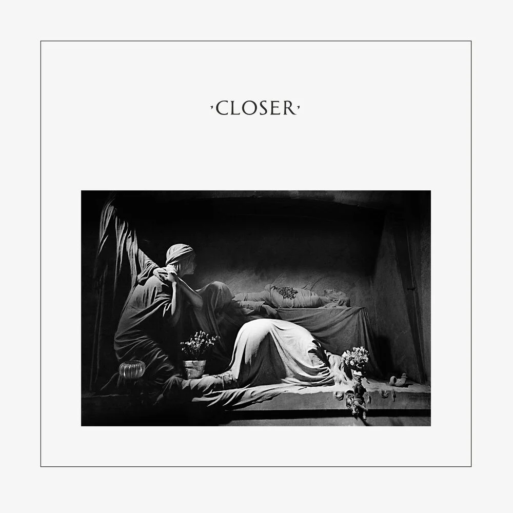
The order of events matters. Saville had brought the band several photographs without knowing where the album was heading. They picked this one without much discussion. Curtis died on 18 May 1980, with the sleeve already in production. Saville later described the shock of realizing that a tomb was about to wrap the last album of a singer who had just died. The band changed nothing. The image wasn't conceived as a tribute, which is exactly why it reads as something that came before the tragedy. An omen, not a mirror.
Power, Corruption & Lies (1983), roses that encode power
For New Order's second album, Saville used a still life by Henri Fantin-Latour, A Basket of Roses (1890), held by the National Gallery in London. In the top right corner sits a block of colored rectangles: a code, part of a color alphabet of his own.
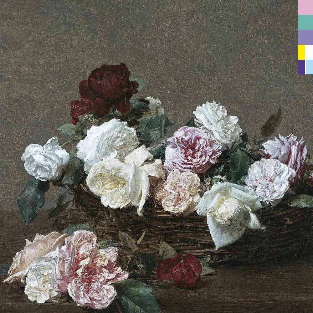
His idea, roughly, was that the flowers stood for the way power, corruption and lies make their way into our lives, which is through seduction. The title, Machiavellian as it is, appears nowhere on the front. The key to the code is printed on the back. MoMA acquired the sleeve in 2014.
Lateness as a method
Saville was notorious for delivering late. Wilson said that some sleeves turned up after the record was already in the shops. This wasn't carelessness. Saville believed an object takes the time it takes. That only worked because of Factory, and because Wilson and Saville complemented each other so completely. Neither would have existed in quite that form without the other.
Beyond Factory
Saville went on to design for Suede, Pulp, Roxy Music and Wham!, then for fashion houses including Burberry, Givenchy and Lacoste. In 2004 he became creative director of the city of Manchester, a post created for him. In 2019, forty years after Unknown Pleasures, the Pace Gallery showed CP1919.
What his work teaches is that taking away is harder than adding. Saville trusts the viewer. Each of his sleeves is a wager on the visual intelligence of whoever picks it up.
Takuya Studio designs record sleeves for independent artists and labels, on the same principle: an album's image deserves the same care as the music it comes with. The same wager on restraint, held for forty years by an entire label, runs through ECM Records covers.