
Geometry as a starting point
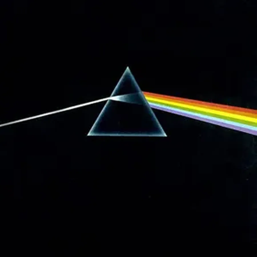
A black triangle on a black ground. A white ray enters from the left, splits into a spectrum as it leaves the prism and vanishes into the dark on the right. No face, no name, no heavy metaphor. Drawn from a diagram in a physics textbook, the image is still, fifty years later, one of the most instantly recognizable album covers in the world. All of Storm Thorgerson's work lies in that relation between the density of the idea and the economy of the means, and it is why he stands among the great album cover designers.
He was born on 28 February 1944 in Potters Bar and grew up in Cambridge, where he went to the same school as Syd Barrett and Roger Waters, who would go on to found Pink Floyd. He read English and philosophy at the University of Leicester, then studied film and television at the Royal College of Art, where he took a master's degree. The rigor of his images, their narrative pull and their refusal of decoration owe a great deal to that training, which had nothing to do with graphic design in the strict sense.
Storm Thorgerson and Hipgnosis, the studio that changed records
In 1968 Thorgerson founded Hipgnosis with Aubrey Powell. The name was made up: hip for whatever was new and alive, gnosis for ancient knowledge, with hypnosis underneath. He liked the clash, he said, for the contradiction it carried.
Hipgnosis worked for fourteen years, until it broke up in the early 1980s, for a client list that maps British rock on its own: Pink Floyd above all, Led Zeppelin, Peter Gabriel, Genesis, Paul McCartney, 10cc, Black Sabbath. The images from that period form one of the most coherent and influential bodies of work in record history. The coherence has nothing to do with style, since each sleeve has its own language. It comes from a method: nothing was put into an image that hadn't first been worked out as an idea.
After Hipgnosis, Thorgerson kept working from his London studio until his death on 18 April 2013. He made sleeves for Muse, Biffy Clyro, Steve Miller and The Mars Volta, and stayed close to Pink Floyd to the end. His last book, The Gathering Storm: A Quartet in Several Parts, was finished a few weeks before he died.
Doctoring the real without leaving it
His method, in his own account, came down to this: he liked photography because it was a medium of the real, where drawing was not, and he liked to tamper with the real. Thorgerson didn't work in illustration, painting or graphic abstraction. He started from photographs, which means from objects, bodies and landscapes that had actually stood in front of a lens. That footing in reality is what makes the results so unsettling. What the image shows is impossible, and you know it was photographed.
The techniques were those of the film darkroom and the real-world shoot: multiple exposures, airbrush retouching, scalpel photomontage, optical tricks, forced perspective. No digital manipulation, out of a belief that the screen breaks the link with matter. In his lifetime the position could pass for conservative. It reads differently now. In a stream of generated images, his sleeves keep a physical weight that is hard to reproduce.
Wish You Were Here (1975), the metaphor taken at its word
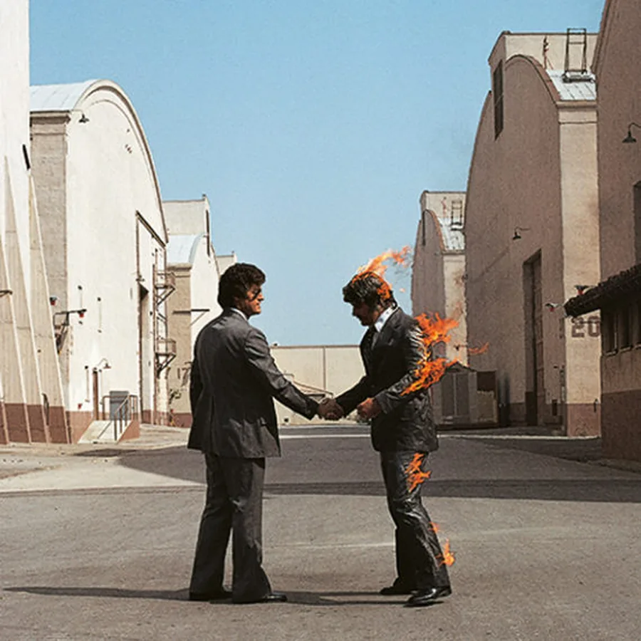
Two men in suits shake hands on a street in Los Angeles. One of them is burning: head, arm, shoulders, real flames caught by the camera as they happened. Thorgerson neither faked nor retouched the picture. He decided the metaphor deserved to be literal: an industry that consumes the people it welcomes, and the absence of Syd Barrett behind the handshake.
This is one of the reasons the work lasts. Thorgerson took his concepts seriously enough to make them physical. Where others would have made an image that suggests fire, he made an image in which someone is on fire. The difference is aesthetic, and moral too. There is commitment in refusing the easy route.
The Division Bell (1994), two heads in a field
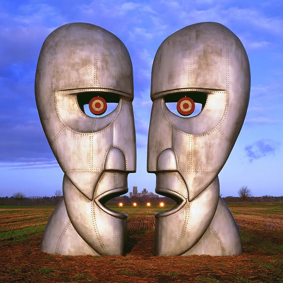
For The Division Bell, Thorgerson had two humanoid heads built in riveted metal, 2.70 meters tall, designed by Keith Breeden and made by John Robertson. He set them up in a field in Cambridgeshire, with the distant outline of Ely Cathedral behind. The heads face each other as if in conversation. Their eyes are red targets, and between their parted mouths a third face appears.
There is no irony in the image. Thorgerson doesn't play on the kitsch of the oversized, and he isn't after surprise for its own sake. He believed in archetypes, in communication as a subject worthy of a monumental picture, and in the idea that if you plant two giant heads in an ordinary English landscape, something true will show itself. The result is grave, almost solemn, and it rests on a conviction more than a concept.
Building, transport, installation, the shoot itself: the setup took an investment of time and money that would now be replaced by a few hours of 3D. The Browse Gallery holds prints of this work that show, better than any argument, what his method meant in practice.
Pulse (1995), the eye as cosmos
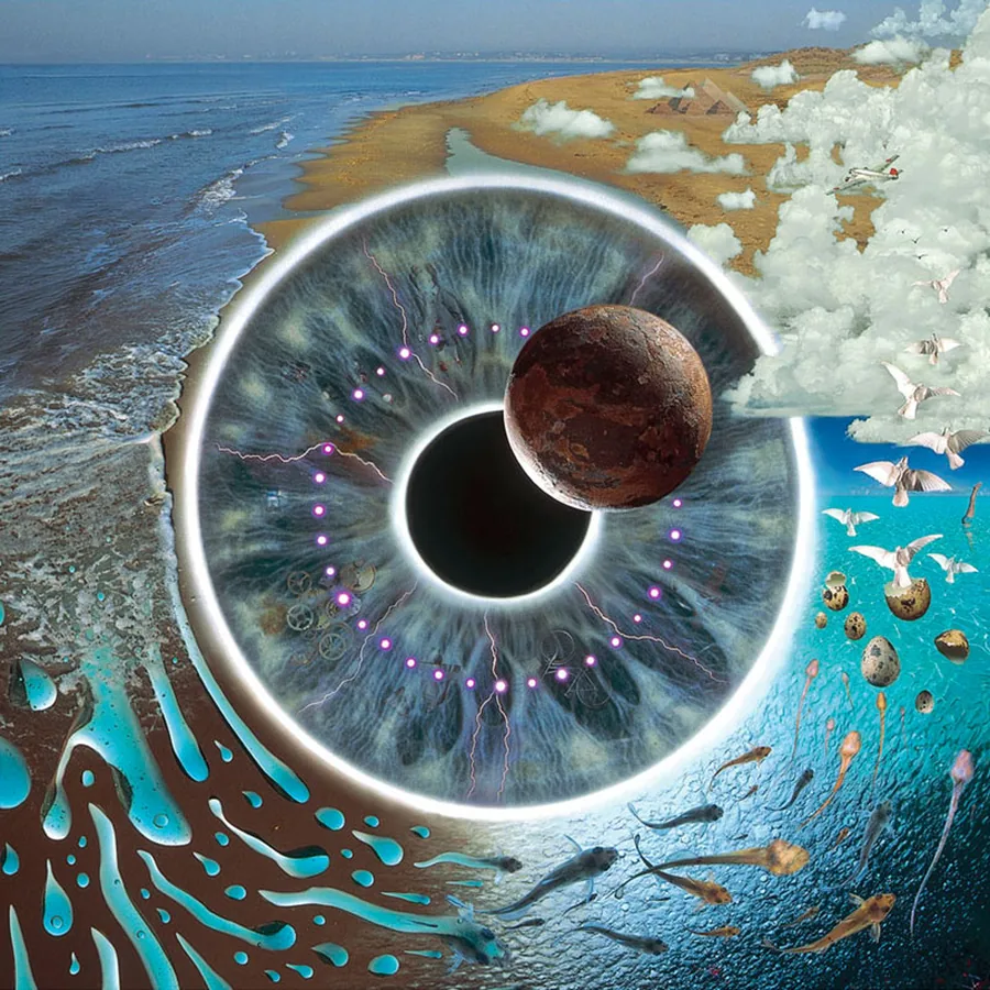
For Pulse, Pink Floyd's live album recorded on the Division Bell tour, Thorgerson built a different kind of image: an enormous human iris opening onto a landscape that doesn't exist, made of fragments of beach, clouds, birds in flight, fish and a planet hanging in space. The eye contains the world, or the world is inside the eye. Both readings hold.
It is one of his works closest to classic surrealism, yet it keeps to his principle. Every element of the collage was photographed, real, tangible. The whole is impossible and every part is true. With Thorgerson the effect is never sleight of hand. It is an assembly of facts that adds up to something more than its parts.
Conviction as a method
Thorgerson's body of work has a rare quality that might be called sincerity of ambition. His images set out to be right rather than beautiful. Beauty, when it came, was a result. That distinction changes how you look at the work.
His closest contemporaries, Barney Bubbles, Peter Saville and Malcolm Garrett, worked in a more typographic register, nearer to graphic design in the traditional sense. Thorgerson stands apart, less a graphic designer than a maker of images, whose sleeves began as ideas before they found a form. That primacy of concept is why they have aged well. A strong idea outlives a style.
The San Francisco Art Exchange presents his work as fine art photography, and the shift makes sense. Thorgerson refused the hierarchy between commercial art and free art: a sleeve commissioned by a label can be a work of art if it is treated as one. He proved it for forty-five years.
A full portrait of his career, influences and methods is published by Hypergallery, with a wide selection of his images set back in the context in which they were made.
Takuya Studio designs record sleeves for independent artists and labels, with the conviction Thorgerson held all his life: an album's image is to be treated as a work, not as a wrapping.