
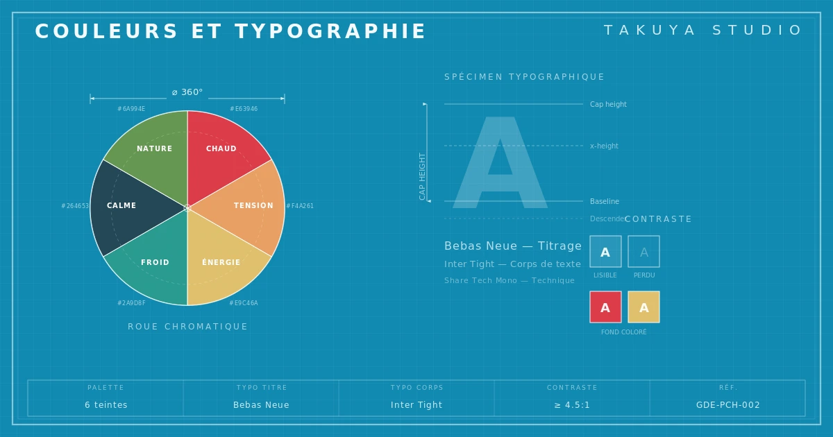
Color and type aren't isolated aesthetic choices. Together they form a system of signs that works before anyone presses play. This is where album cover color psychology starts. The diagram maps the main color and type families as they settled into the history of cover design, less as recipes than as territories whose codes are worth knowing before you break them.
The eye decides before the ear
Before the first bar reaches anyone's ears, a verdict has already been reached. An album cover isn't optional decoration. It's a system of signs that communicates the genre, the tone and the community the artist belongs to. That language works in a few seconds, often without anyone noticing. The listener doesn't read the cover, they recognize it. Designing a record sleeve that works is a strategic decision before it's an aesthetic one. Picking a typeface, a palette, a level of visual density means picking who you're talking to and what you say before you've said anything.
Music's visual codes weren't born in design studios. They formed by accumulation, imitation and reaction, the same way genres did. A typeface, a color, a composition carries the history of the covers that came before, the references of the artists who took them up, and the expectations of audiences who ended up linking them to a sound. Understanding those codes means understanding how a genre is recognized by the eye before it's heard.
Metal and its unreadable type, a deliberate refusal
In metal, especially death metal and black metal, there's a tradition of making the band's name deliberately unreadable. Interlaced letters, overlapping gothic spurs, shapes closer to ornament than to language. This convention is neither an accident nor the clumsiness of beginner designers.
It's a radical code of belonging. Illegibility works as a filter: only people who already know the band can read its name. The type shuts people out as much as it lets them in. It signals that this music isn't looking for a wide audience, only for its own. The style says: if you can't read this, maybe this record isn't for you.
Formally, these logos gravitate around a few families: medieval blackletter, gothic derivatives, organic forms inspired by roots and thorns. They carry old references, woodcuts, illuminated manuscripts, runic symbolism. Metal's visual violence rests on a paradox, forms of great ornamental complexity serving a brutal message. Type designers such as those who have studied gothic lettering note that these forms were long seen as "national" in some cultures, something metal turned into a stance of transgression.
The palette confirms the message. Black dominates, no shading. Blood red, aged gold, bone white. No compromise, no soothing color scheme. The colors reinforce the border between metal's world and everything else. Color psychology doesn't work here through literal symbolism. It builds a territory.
Electronic music and minimalism, when empty space is the signal
At the other end from that saturation, electronic music (techno, ambient, experimental electronica) developed a visual vocabulary based on restraint. Albums on labels such as Warp Records, Kompakt or Hyperdub set a recognizable look: sans serif type, generous space, palettes cut down to two or three colors, compositions either asymmetric or firmly centered.
The restraint is a conceptual choice, emptiness as a signal. White space says something about the music, its abstraction, its relationship to long stretches of time, its refusal of flash. Cold geometric type (Helvetica, Akzidenz-Grotesk, the modern grotesques) conveys rigor and distance, sometimes a coldness fully owned. These typefaces came out of the International Typographic Style of the 1950s, a Swiss school that wanted design to serve information without drawing attention to itself. Electronic music turned it into an aesthetic manifesto.
In electronic music, typography often works as the signature of a school. Berlin minimalism isn't British ambient minimalism, nor Chicago techno's. The subgenres have their nuances, and they share a rejection of the decorative excess metal embraces without restraint. Color works differently in this register: digital gradients, acid flat tones, radical monochrome. Some labels built their identity on a single pattern or color, a consistency that turns the catalog into one continuous visual work.
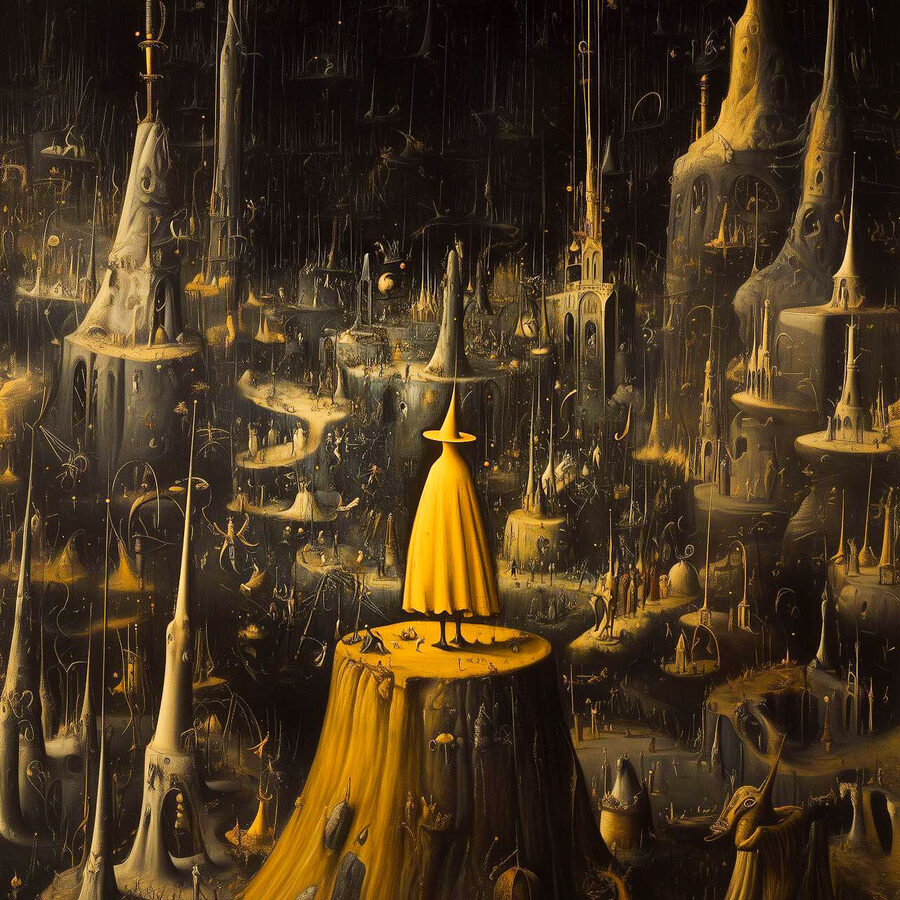
Hip-hop, jazz and indie rock, three separate visual regimes
Hip-hop developed its own visual regime, and it keeps moving. Early on, graffiti dominated: broken letterforms, saturated colors, excess as a principle. The 1990s brought more complex codes. Photographs treated like icons, street culture mixed with the codes of luxury, type that borrowed as much from the 1970s as from 1960s Swiss faces. Today a hip-hop cover can do anything, from the near-conceptual restraint of some recent albums to the saturated visuals of UK drill. The genre has digested enough history to no longer have a single code. What defines it visually is that capacity to absorb and repurpose, an identity built on the permanent remix.
Jazz carries a visual memory of remarkable consistency. The Blue Note covers of the 1950s and 1960s, designed by Reid Miles, defined a look that still influences designers today: sans serif type, black-and-white or duotone photographs, asymmetric compositions. They conveyed modernity, sophistication and cultivated marginality at once, with a signature so strong you can spot a Blue Note album at first glance without reading the artist's name.
Indie rock is the most varied ground. It borrows from everything, Swiss design, American folk illustration, documentary photography, contemporary art. What often sets it apart is a particular relationship to craft and to deliberate imperfection, a rejection of industrial polish in favor of a finish that says "made by hand." Screen printing, photocopying, collage: techniques that give a cover a texture the flawless digital file can't reproduce.
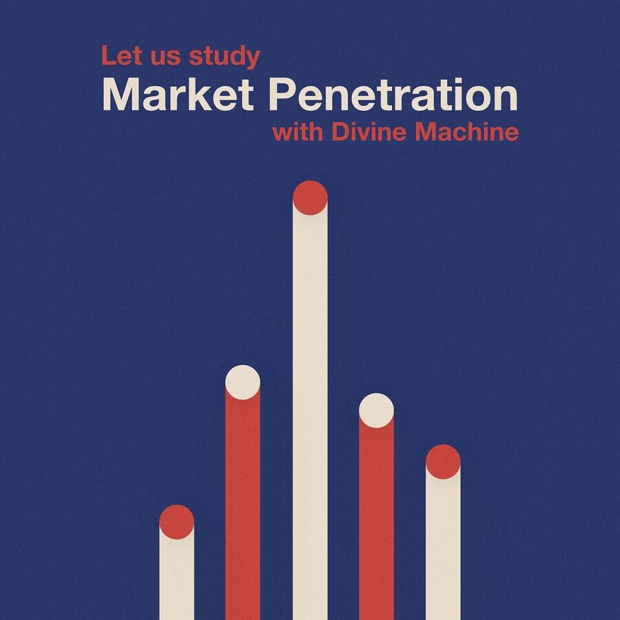
Color marks an era as much as a genre
In art direction, color psychology doesn't come down to simple symbolic equivalents, red for energy, blue for melancholy. Those associations exist, but they don't hold up long against the complexity of real use.
What works is the combination of a color with a typeface, a composition, a texture. Metal's black isn't the black of minimal electronica. The white of an ambient cover isn't the white of a pop album. Context decides the meaning.
What color does well is signal an era and an emotional register. Washed-out pastels point to a certain 2010s indie pop. Acid colors and synthetic gradients recall vaporwave or 1980s electronic productions. Earthy palettes suggest folk or Americana. These associations are culturally built; they shift and move over time. Careful art direction uses them knowingly, or twists them to create a meaningful gap between image and sound.
Then there's the display context. On a 30 × 30 cm vinyl sleeve, a color asserts itself physically. As a streaming thumbnail at 56 × 56 pixels, only the boldest compositions survive. The two cases call for different answers, and color behaves differently depending on scale.

Building a coherent visual identity, the questions to ask first
The question for an artist, and for the people helping with their art direction, isn't "which typeface is beautiful?" It's "which visual language does my work belong to, and does my cover say so clearly?"
That means first identifying the visual references of the genre, not to copy them but to understand what the audience expects, and to decide with full knowledge whether to confirm or subvert those expectations. A metal band that adopts a clean typeface sends a message. So does an electronic artist who picks a blackletter. These choices work better the more intentional they are.
It then means questioning consistency over time. A visual identity isn't one cover. It extends to press photos, stage visuals, social media profiles, concert posters. Consistency across those surfaces turns an image into a recognizable identity. That's where art direction shows its strategic value: less decorating an album than building a visual territory people can live in for the long run.
Coherence between sound and image isn't a constraint. It's a resource. A listener who sees the cover before listening already arrives in a certain frame of mind, with expectations. If they're confirmed, the satisfaction doubles. If they're overturned with good reason, the surprise can become a signature. Both strategies work, as long as they're chosen.
Takuya Studio works with artists and labels on album cover design and art direction, in Paris, since the studio was founded in 2016.