

Stefan Sagmeister and skin as a printing surface
There is a well-known photograph of Stefan Sagmeister with his shirt off, his torso cut with a blade by his assistant. The letters spell out the details of a lecture for AIGA Detroit, in 1999. Three years earlier he had already written Lou Reed's lyrics across the singer's portrait for Set the Twilight Reeling. Among the major figures of album cover design, Sagmeister is the one who took the body most literally.
He was born in 1962 in Bregenz, in Austria, and studied at the Universität für angewandte Kunst in Vienna before a Fulbright scholarship took him to the Pratt Institute in New York. In 1993 he set up Sagmeister Inc. in Manhattan and kept it deliberately small, two or three people. It was a craftsman's choice, made against the big agencies.
Lou Reed (1996), writing on a face
The portrait on Set the Twilight Reeling was taken by Timothy Greenfield-Sanders. Sagmeister wrote Reed's lyrics by hand directly onto the print, over the face, so that the text and the man merge. The result is a palimpsest: the song written on the person who sings it. It anticipated by twenty years the arguments about visual saturation.
Reed, reputedly difficult and wary of art directors, had given him carte blanche. An image this intimate needed that trust: the singer's voice covering his own face.
The Rolling Stones (1997), Bridges to Babylon

With the Rolling Stones, Sagmeister was dealing with institutional rock and every brand constraint that comes with it. He answered with a sleeve that has no rock reference in it at all: an Assyrian lion, Mesopotamian ornament, and finishes (gilding, spot varnish, textures) that make you handle the record before you hear it. The sleeve earned him a Grammy nomination for best recording package. His first win came in 2005, for the Talking Heads box set Once in a Lifetime, and a second followed later. The awards matter for one reason only: a cautious industry was recognizing work that unsettled it.
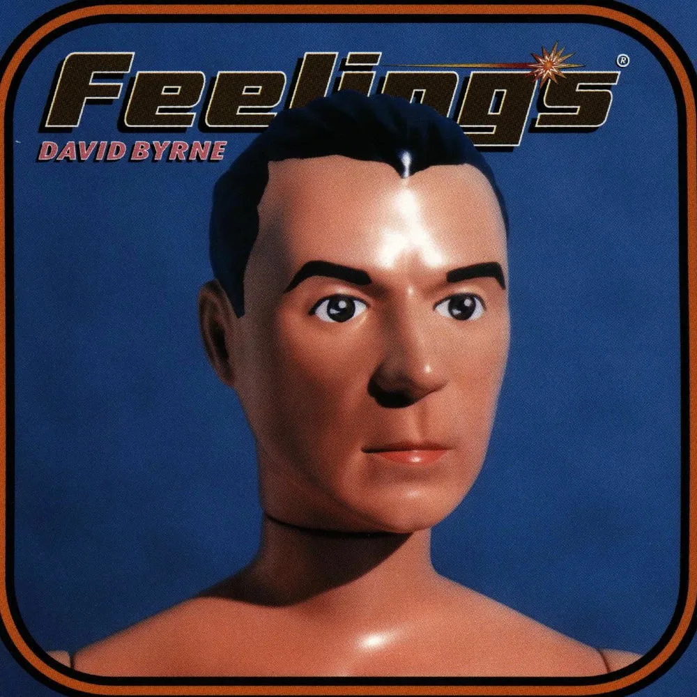
David Byrne (1997), touch to understand
For David Byrne's Feelings, Sagmeister turned the CD case into something you play with as much as look at, built around figures of Byrne and the emotions written on a face, a subject the two men were equally curious about. You don't just look at this sleeve. You handle it.
That is the constant in his work: a refusal of the purely visual. His sleeves are objects to touch, open, fold, scratch.
Sabbaticals, emptiness as a method
Every seven years, Sagmeister closes the studio for a year. He explained the principle in a TED talk in 2009: the work that comes after each sabbatical is better than the work before it. Emptiness produces density.
The Happy Show, which grew out of those years, was shown at the MAK in Vienna among other stops on a tour that ran from 2012 to 2015.
The show mixed design, cognitive psychology and installation. It drew more visitors than any other contemporary design exhibition at the institutions that hosted it, and it showed that graphic design could produce a public experience as intense as an artwork.
The irreducibly physical
What runs through all of Sagmeister's work is direct intervention on the real: type cut into skin, cases you take apart, paper you scratch. As music dematerialized (vinyl to CD, CD to streaming, streaming to thumbnail), design that can't be held lost a limb. Sagmeister's answer is strategic rather than nostalgic. He makes objects that can't be reduced to a thumbnail. His sleeves don't circulate as images. They exist as artifacts, and that resistance to reproduction gives them a longevity few images made to circulate ever reach.
Takuya Studio designs record sleeves for independent artists and labels, on the same principle: an album's image deserves the same care as the music it comes with.